11 Examples of High-Converting Blog Homepages in 2022
Website conversion is one of the indicators of success.
Why is it so?
Because there are millions of blogs. To be more precise, 600 million of them. Yet, not every blog home page is built right to effectively convert readers.
What if we say that you have under eight seconds to convince a user to stay on your site and read your blog posts? Well, you do have not that much time to do this.
Nevertheless, it’s possible. We’ve gathered examples of high-converting websites to inspire you and show you how to layout your blog correctly.
So, let’s begin with some main rules you’d better stick to and move to some stunning designs.
What elements a high-converting blog homepage should have?
First and foremost, you should remember that the blog homepage differs from the landing page or just the site’s homepage.
This way, you should remember about some main elements converting homepage should have.
Layout
You need to think about how many articles per page you’d like to show. You can keep it minimalistic and show one article per window, or a couple of them.
Also, you might want to do something creative and make your blog stand out with out-of-the-box ideas.
Imaginary
71% of bloggers share that they use visuals as part of their marketing strategy. The same should apply to your blog’s homepage to make it convert.
Ensure pictures complement your blog and tell more about it.
Preview text
Do you want your layout to feature only the article’s cover picture and its title? Or should it have a preview text as well?
Sure thing, preview text may give readers more insights on articles. But then remember it will make a design a bit “heavier.” That means you need to balance other elements to keep your homepage clean.
You might also like: How to Create a High Converting Landing Page
Social share buttons
We’ve already shared that blog promotion is highly essential. Social media play one of the most important roles in this process.
So, readers should easily understand how they can share your work. The social button may be static or relocate as readers scroll through. Simply pick what fits you better.
Subscribe button
The more people subscribe to your blog the better. Accordingly, ensure users can access the subscription form easily.
Basically, you can count the website conversion (or in our case of a blog) by the number of subscribers. So, this element is a must-have one.
Menu & sidebar
The choice is totally yours in this case. Yet, once again, everything should be logical and not confusing for readers.
You can include the author’s bio, link to the most popular posts, whatsoever. Make sure every element is helpful.
15 examples of high-converting blog homepages
1. Backlinko
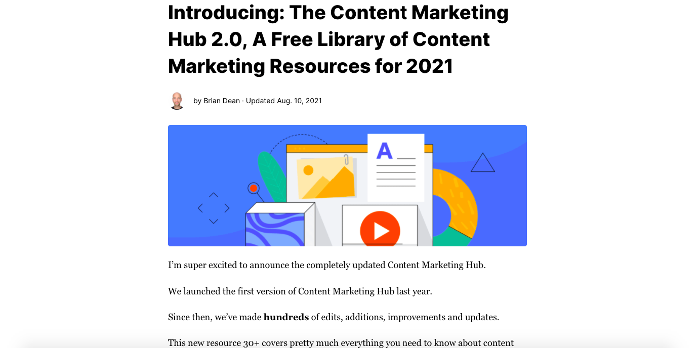
That’s a blog by content marketing guru Brian Dean.
Of course, we could expect nothing but excellence from him. From the very first window, we can see that Brian is ready to convert! The blog’s layout is super minimalistic with one blog article in a window only.
What’s great: It has an informative preview that engages customers. Also, the number of comments shows that his articles are highly discussed. Moreover, Brian converts users thanks to the paywall system offering to unlock articles after a paid subscription.
2. Microsft Story Lab
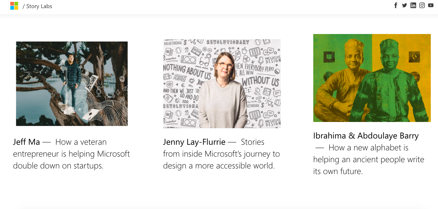
This tech giant has a great space to share stories about what’s new in the technology world.
Sure thing, Microsoft has created a technology-driven blog home page (and blog pages as well). It is super easy to navigate through the page.
What’s great: The design is pretty minimalistic - white background lets Microsoft add bright cover images and short article descriptions. Every image perfectly complements each article, so that readers understand what’s inside.
You might also like: How to Increase Engagement on Your Website in 7 Steps
3. Hubspot blog
That’s a blog of a huge marketing hub, praised by many industry professionals.
It’s a rather rich page design. But that doesn’t make the use of the blog homepage complicated. The whole layout is made of geometrical blocks offering articles on various topics.
What’s great: Hubspot’s blog homepage design shows you how to increase conversion for your blog as well. Use a subscription form offering readers to pick topics they want to know better. Make your subscription form noticeable to ensure a high conversion rate.
4. Adsy
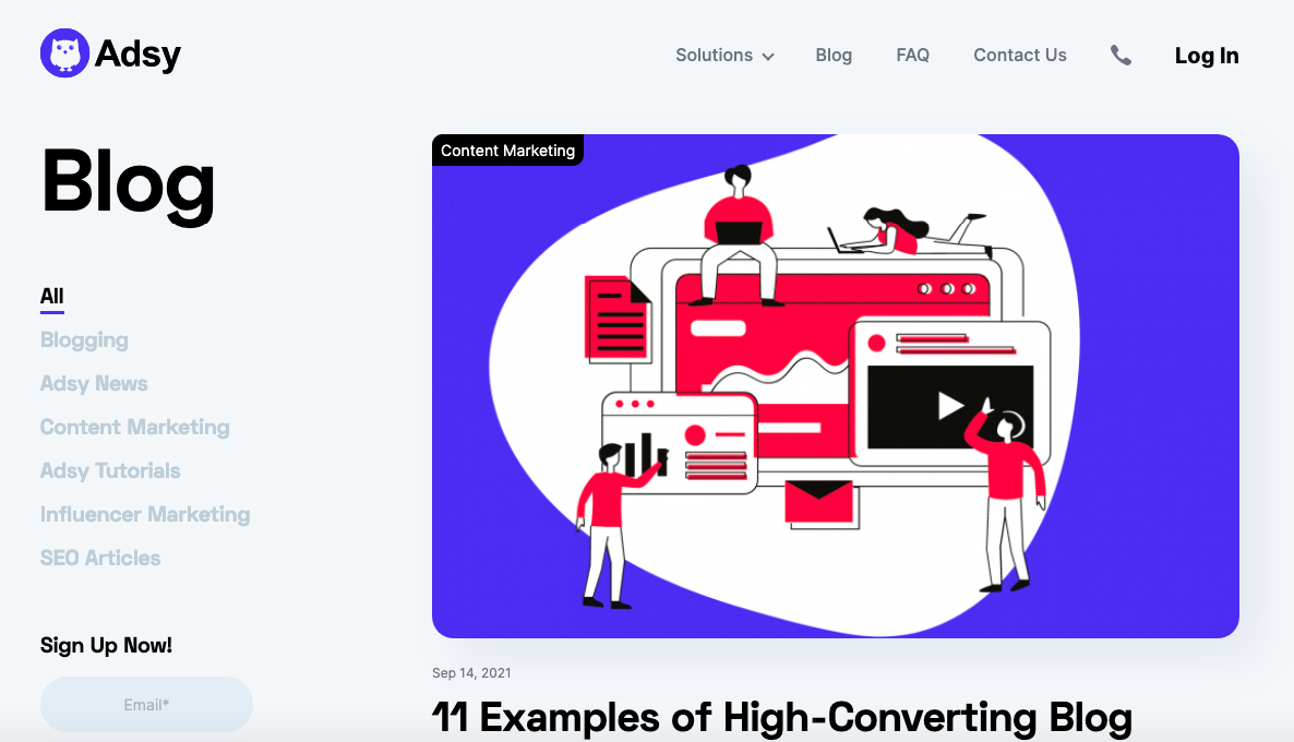
And here comes a blog from a guest posting service called Adsy.
After opening the blog homepage, readers can easily pick the sub-topic they’d like to learn more about. The first window shows the most current article. Then there’re two articles per window. So, the layout is pretty light.
What’s great: Each article has a publication date and reading time. It’s easy to understand how current each article is and how much time you require to read one.
5. Canva
A blog by the online designing tool Canva is a nice sample of how a blog homepage should look.
It uses a minimalistic design with a white background. Canva has divided the page into separate blocks showing articles for different topics. Some blocks show three articles per row and some two.
What’s great: Canva goes pretty specific sub-topics. So, for instance, you can see not only the “Design” label but also the “Design trends 2022.” This way, readers can choose the best-fitting article.
6. Adode
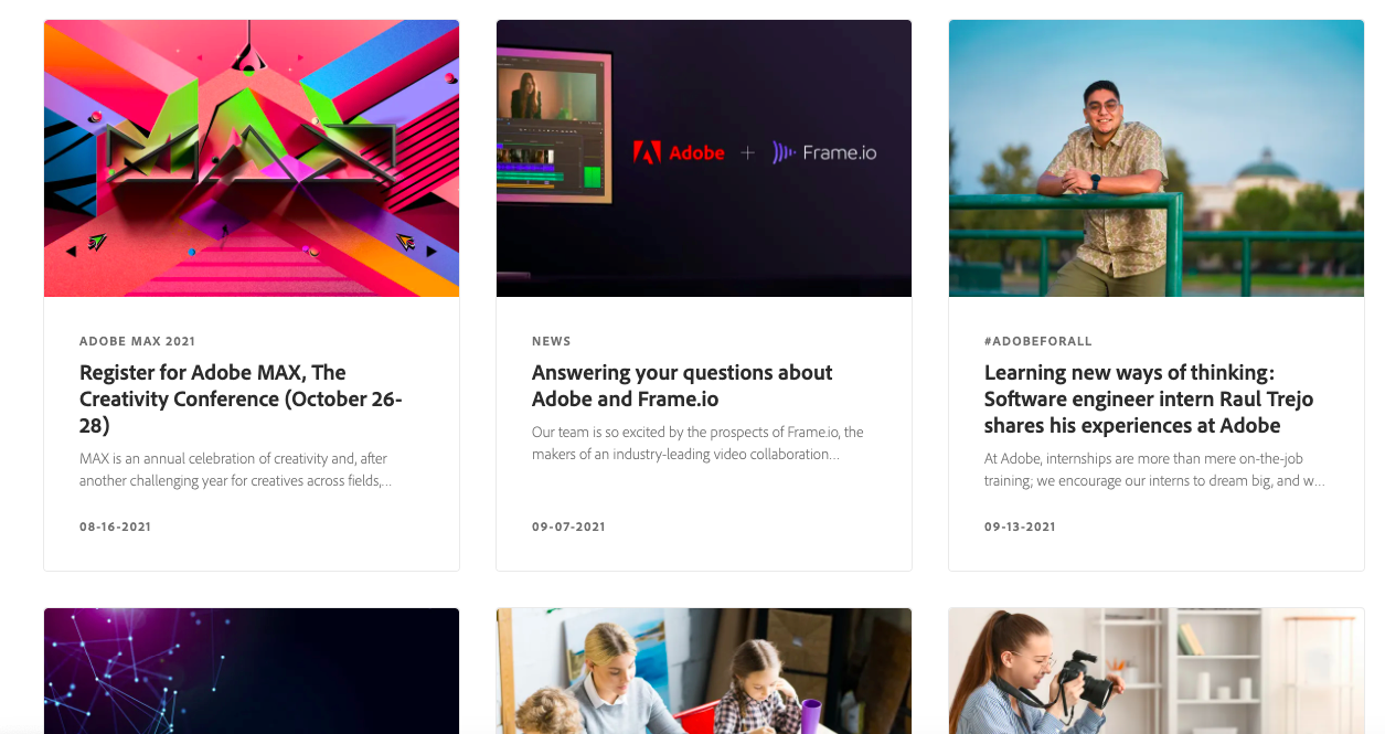
Other design adepts here. And they are Adobe. What can we expect from them?
Well, something cool for sure. Once again, like other top companies, Adobe’s blog is clean and minimalistic. White background and light (also white background-based) boxes for articles make the homepage neat.
What’s great: Thanks color choice, information-rich windows on the Adobe blog don’t look heavy. Readers can see not only articles’ titles, but also the date of publication and a short description.
7. Wholefoods Magazine
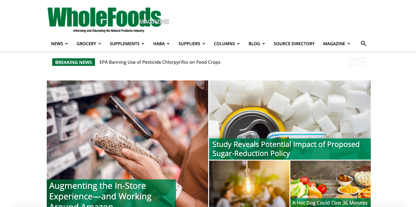
Wholefoods, an American supermarket chain, also runs a blog and educates people about all-thing food.
The homepage combines white background with green elements. Remember, that using the right colors is vital too. And green is a perfect choice for a food blog, as it symbolizes nature and the environment.
What’s great: To convert better you may use a pop-window with a subscription form and also provide it in the sidebar of your blog homepage. If you cover a variety of topics, don’t forget to leave the option of multiple-choice to your readers.
8. Forever21
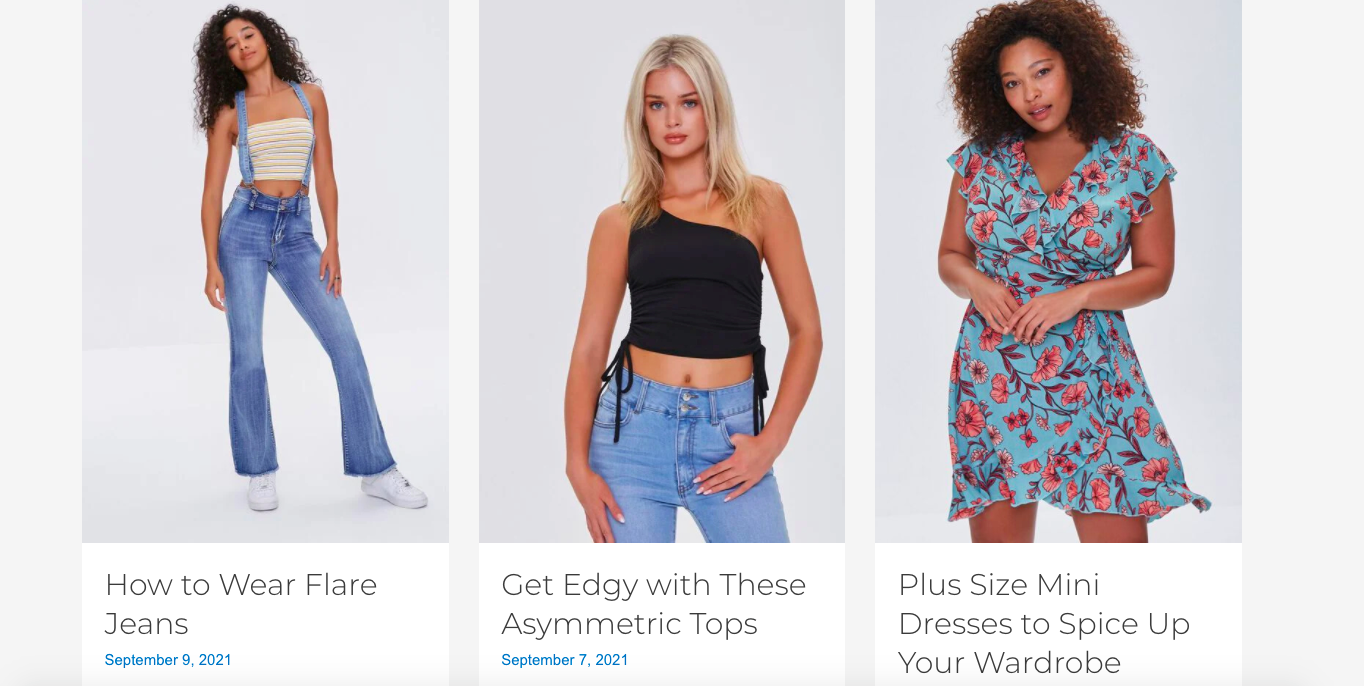
If you run a clothing store, don’t forget to have yourself a pretty and cozy blog.
This popular clothing brand runs a blog in moderate colors. The main emphasis is bright professional pictures of models demonstrating the brand’s clothing.
What’s great: Every article has a short preview text and publication date. So, you won’t miss out on the latest trends. There’s a helpful menu with categories at the very top of the page. This type of blog helps you convert readers straight into buyers by offering fashionable looks or separate clothing pieces.
9. Bed Bath & Beyond
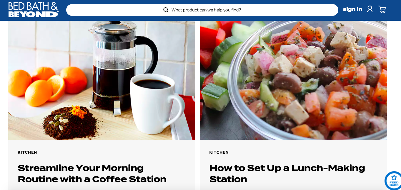
Are you running a home makeover, construction, or any related business? Then the blog is what you need to convert people.
Check how this well-known company builds high converting blog homepage. It offers various topics to choose from. From dining to decorating a room, readers can find whatever they wish.
What’s great: Bed Bath & Beyond not only provides helpful guides and pieces of advice but also allows you to buy the product straight from the article.
10. Evernote
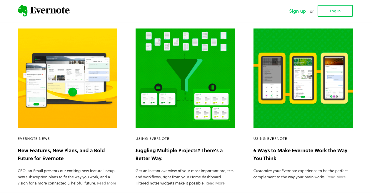
Evernote is an online tool for writing, capturing, and organizing ideas. And the company’s blog helps to enhance creativity.
Like many other companies, Evernote uses moderate background color. Yet, every cover picture is bright enough to grasp users’ attention.
What’s great: We love how Evernote uses the layout. This way, it combines two articles per window with three posts per window. Some covers are animated, which definitely can drive even more attention.
11. Web Designer Depot
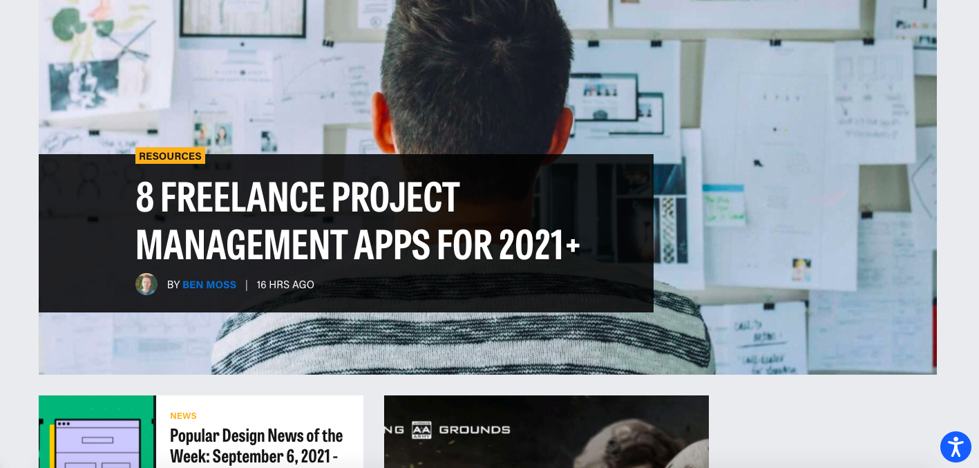
That’s a designer resource with guides, tips, and ideas for designers from all over the globe.
From very first sight, this blog catches attention with rich colors. Also, every article is marked with the sub-topic it covers and the publication date.
What’s great: Web Designer Depot shows a couple of articles per row. Yet, they break those multiple sequences with one article with a huger cover image size. That definitely puts emphasis on a certain post and allows it to stand it out.
Conclusion
Creating a high-converting blog homepage is not always an easy task. Yet, when you know some approaches, you can win this game.
Today we shared the most essential elements your blog page should have. Also, you had a look at blog homepages designs we really adore. Make use of these ideas to create something special for your blog.
Share what homepages you like the most. What strategies would you like to repeat in your blog?
All trademarks, logos, images, and materials are the property of their respective rights holders.
They are used solely for informational, analytical, and review purposes in accordance with applicable copyright law.