How to Create a High Converting Landing Page
At some point, every marketer thinks about how to create a landing page. It’s the perfect means of attracting new customers and converting them into buyers.
In fact, businesses that produce 30 or more landing pages generate seven times more leads compared to companies with fewer than ten pages.
But what if you don’t know where to get started?
Then we advise you to continue reading. Today, we are going to talk about the anatomy of the high-converting landing page. You will learn about seven essential landing page elements to convert prospects into leads.
So, keep reading to know all the ins and outs of an effective landing page.
What is a landing page?
Before jumping to the elements, let’s consider some things. So, what is a landing page?
A landing page is one of the pages on the website or a specifically created separate page.
All-in-all, the main landing page aim is a conversion raise. And you shouldn’t connect it with the sales increase only. The landing page should support your company’s marketing goal. Accordingly, conversion can mean acknowledgment of a new product, participating in a webinar, attending a conference, and so on.
Sometimes, a landing page equals a homepage. Optinmoster shares that 77% of landing pages are represented as a homepage. But you should understand that there’s also a hint to it.
If your site’s homepage aims to convert - you can consider it as a landing page. So, generally try not to confuse these two page types.
Also, a landing page’s differential feature is how users find it. Firstly, it may be an organic search. That’s because this page contains enough keywords and can support the search intent. Secondly, it may be a paid ad. Marketers promote it this way to ensure that relevant prospects may see it on SERP.
Summing this up, we can see that a landing page is a new leads engagement tool.
The must-haves of the high-converting landing page
So, now we know the goal of the landing page. But how do we ensure that it is high-converting? We’ve gathered seven working elements to decrease the landing page bounce rate and ensure conversions.
Persuasive heading and subheading
As provided by a Microsoft study, the average humans’ attention span is eight seconds. Which is not that much. Your goal is to grasp users’ attention from the very first sight.
That’s why you should pay truly precise attention to the heading you compel. We’ve gathered some major recommendations for your heading.
The landing page heading should be:
- Short and sweet. Keep it between 10 to 20 words.
- Clear. Describe what this page is about.
- Creative. Your main aim is to awaken curiosity & customers’ interest.
- Helpful. Show how this page can solve one’s problem or offer some useful experience.
Besides this, it’s a great idea to complement the first window (with the heading) with a relevant picture. This way, customers will get the full idea of what they will get or learn.

So, after you’ve grabbed users’ attention with the heading, it’s time to provide a little bit more information. And it’s possible thanks to the subheading.
This element of the converting landing page will offer further information about your product/service. Yet subheading also works as an additional hook to persuade customers to use your brand.
As well as the heading, the subheading has some features. Let’s learn more about them.
The landing page subheading should be:
- Informative. Provide deeper insight into the landing page.
- Persuasive. Don’t forget that the main aim of the landing page is conversion.
- Transparent. Place your subheading right after the heading for the full picture.
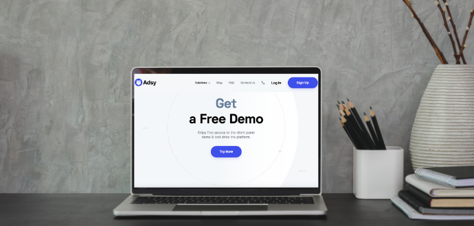
That’s how you get started with the landing page. Now let’s look through some great examples that can inspire you. Plus, we’ll share some things you should avoid.
YES.
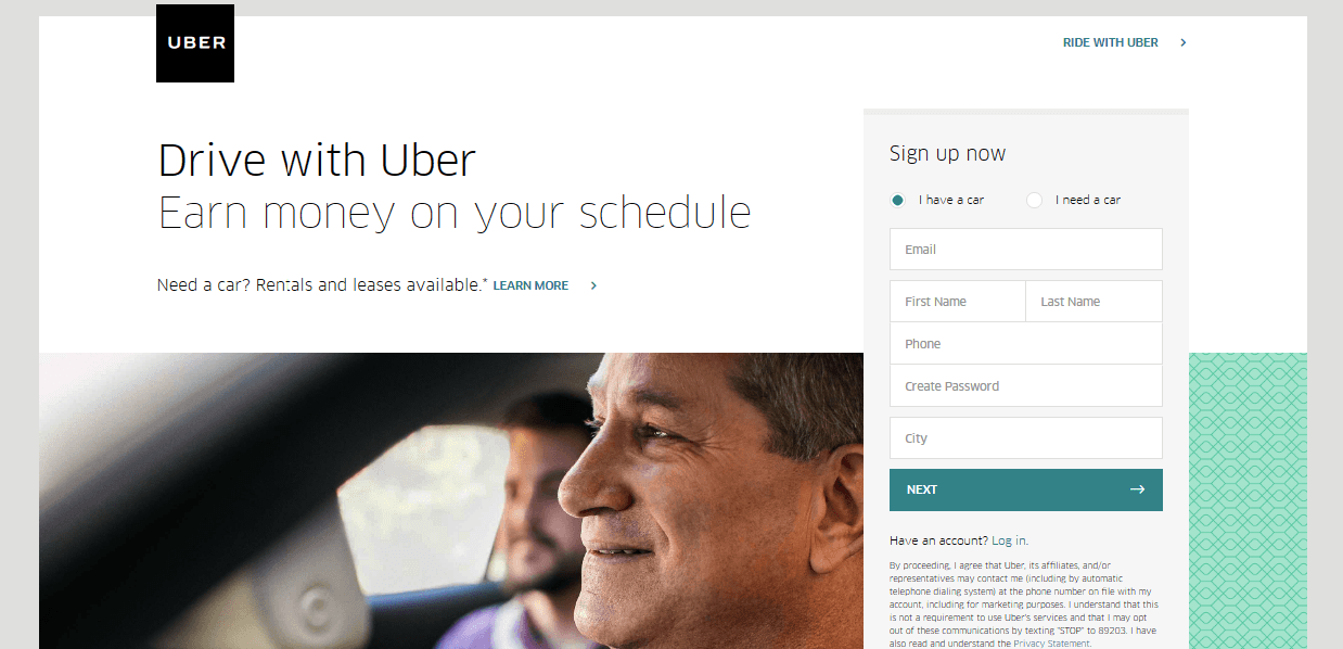
We love how Uber easily shows what this page is about. The heading is super clear and straight to the point. Plus, it shows what benefits Uber can offer drivers.
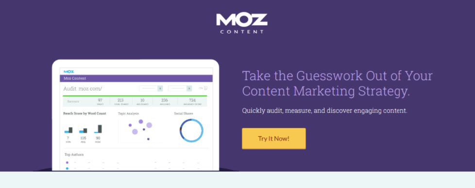
Moz shows how marketers should work with headings and subheadings! You can understand what this page is about. Moreover, the heading contains the pains customers may experience and gives a solution right in the subheading.
NO.
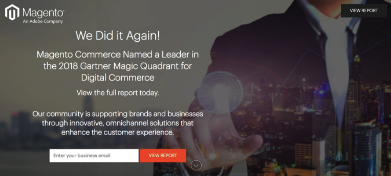
We love how Magento empowers eCommerce. Yet that’s not the best example of the heading and subheading we can recommend. We find it too wordy. Remember, your goal is to keep them clear yet short.
You might also like: How to Increase Engagement on Your Website in 7 Steps
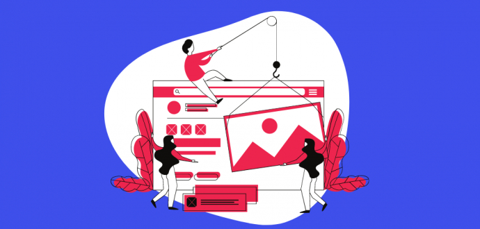
Visuals
According to Xerox, colorfulness results in comprehension raise by up to 73% and 80% more motivation and willingness to read.
So, the way your landing page looks is as vital as what text it contains. Respectively, adding a high-quality picture or video is always a good idea.
Of course, there are some requirements for visuals. They should be:
- of high resolution,
- relevant,
- engaging.
The pictures you add to the landing page should support its message. So, if you are introducing your new product, add its image. Are you offering something intangible? Then find a related picture/video that will induce emotions.
Now let’s study some high-converting landing page examples that employ visuals.
YES.
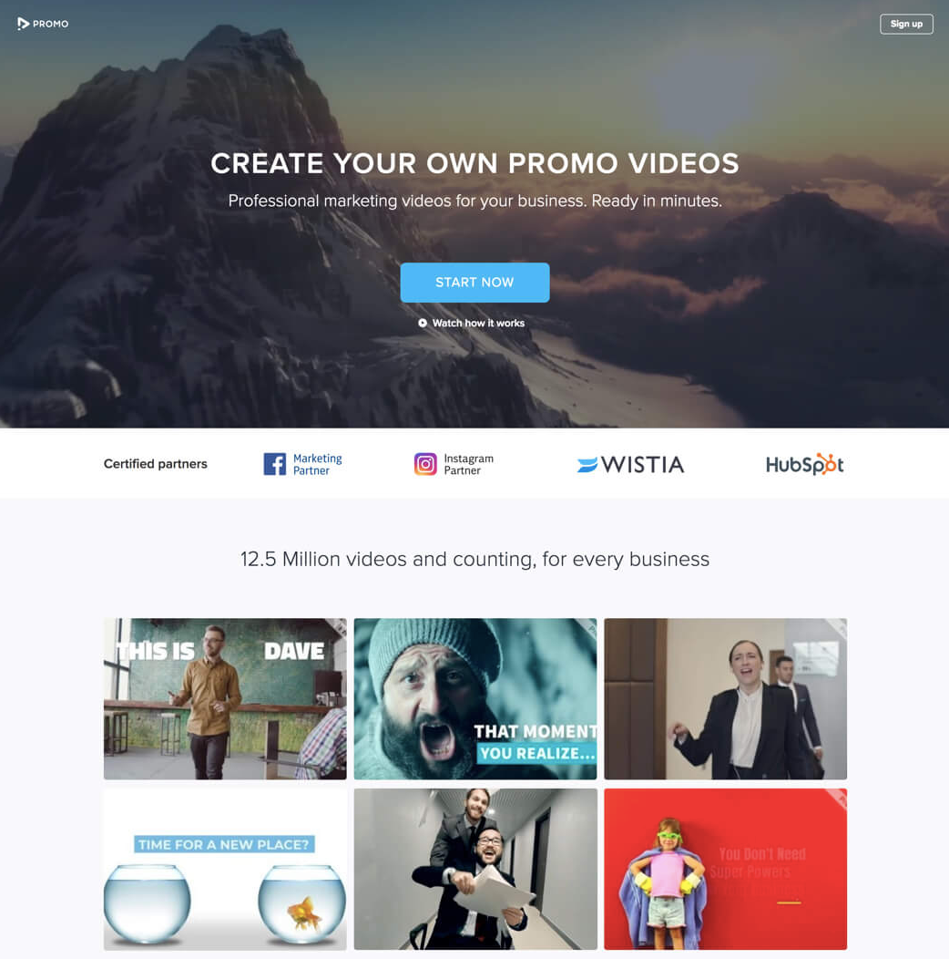
Promo offers a variety of videos for creating promos for businesses. Its visuals showcase what services this brand offers.
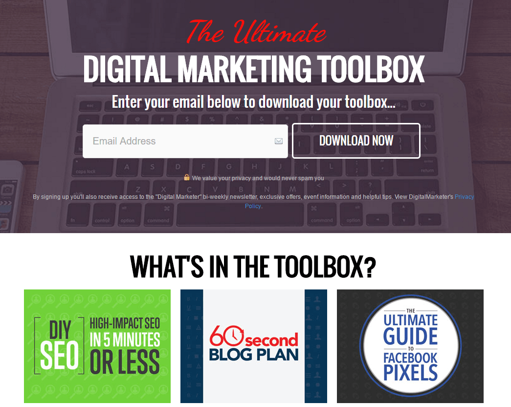
This is another example of when visuals give a more in-depth insight into what the user gets after downloading a toolbox. A laptop has a strong connection with something digital, and the posters below show what’s inside the deal.
Pains
Yes, you’ve heard it right. We advise mentioning some pain points. In the end, it’s not only about happiness and unicorns.
Yet don’t take it too straightforward. You don’t need to write about hardships only. Instead, show how your service can help or why your product makes users’ lives easier. Also, feel free to appeal to the good old FOMO (fear of missing out).
How can you implement natively-placed pain points on your landing page?
- Think of the difficulties your target audience may face. Mention this couple of times, and don’t forget to offer a solution.
- Are some services/products pricey in your industry? Or do you offer some expensive goods? Show why your product is worth buying. It might be additional products you include for free or some insights users can’t find anywhere else.
- Say how you can help get rid of the pain. If you effectively solve the users’ problems, they will be highly interested in trying your services/goods. And often, the price tag won’t stop them.
In the end, it all leads to showing how your services/goods can help to relieve the pain.
Now let’s jump to an example.
YES.

This landing has clearly-defined pains real estate professionals may face. The free eBook serves as a solution that will relieve the pain.
Gains
Killing the pain is not enough. You should offer something extra to convert users.
You can appeal to emotions or numbers - whatever works better for you and your current/potential users. Think of unique selling points (USP) - with gains - you can offer.
How can users relate to your products? How do they make your users feel special? How can they ease their lives?
Do you struggle with content marketing? Claim a free consultation!
So, do your best to find an emotional attraction or offer some pleasure. Remember, you are selling more than just a product or a service.
Now, let’s see how some companies use our emotions on their landing pages.
YES.
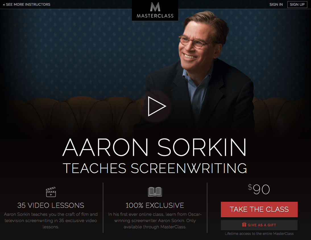
Masterclass appeals to exclusivity. And it’s a great tactic. Who doesn’t want to be in a privileged circle of people and get a lesson from the Oscar-winning screenwriter?
Your contact information
According to Stanford Web, adding contact details on your landing page boosts credibility. Also, you should assume the word “contact" in its broad meaning.
To persuade people that you are a trustworthy business, make sure to provide various means of contact. This may include your email address, phone number, physical address, contact form, etc.
At some point, if appropriate, you can use chatbots.
The main aim of the contact information is to prove:
- You are a real business (by providing a physical address and phone number).
- You are open to a conversation (by employing a contact form or a chatbot).
So, in some form, try to implement this element onto your landing page.
We are moving to some examples, once again.
YES.
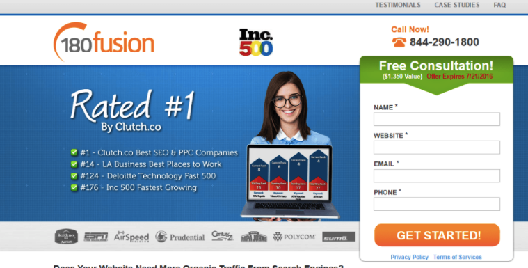
This brand provides its phone number right in the first window and follows up with a contact form customers can easily use.
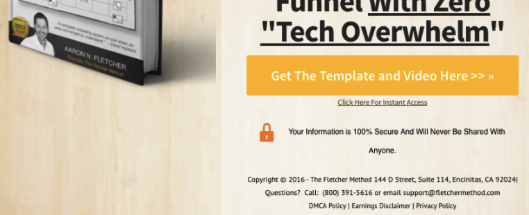
Fletcher Method gives even broader contact information by adding a physical address and email to the phone number.
Guarantee
Also, a high-converting landing page design should contain guarantees. That will keep customers feeling safer and more assured.
Just a phrase with a promise from your company can increase the conversion rate.
How to work with a guarantee on the landing page:
- Guarantees are very different. You may use any form of guarantee. Pick whatever works for your business. It might be a money-back guarantee, post-sale service, etc.
- Your company’s promise to customers. This will work if you don’t have a clear guarantee. You can replace it with another relevant message. For example, no-spam guarantee if you are collecting email addresses.
- Guarantee’s location. To make the guarantee obvious, place it close to the CTA. Another option is to allocate a separate window for the guarantees.
Guarantees will make your new customers feel protected from unexpected situations. Moreover, you will show your readiness to care about the customers’ needs.
And now, let’s take a look at the guarantees different landing pages offer.
YES.
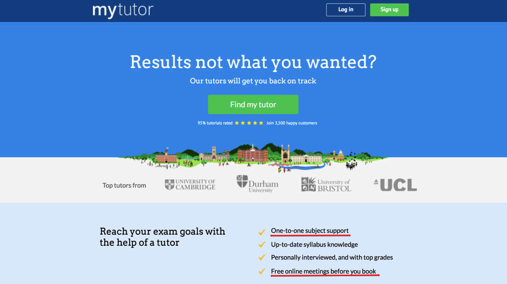
In this example, we can see an illustration of a company’s promise to their future clients. This way, they know there is no charge until they pass the trial meeting. Also, every student can receive support while they take a course.
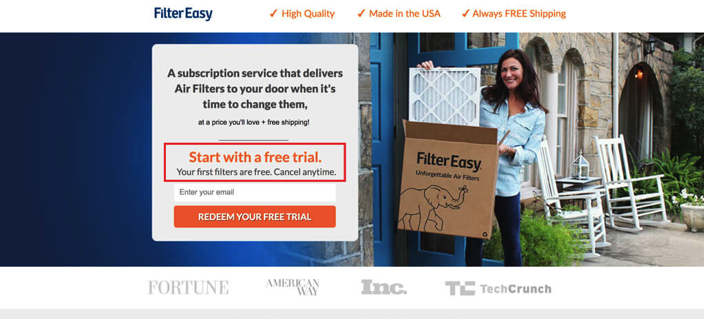
And here is a classic example of a guarantee. Not only do users get the first filter for free, but they also can cancel the subscription at any time. Also, take a look at the guarantee’s location. It’s close to the CTA button, so it’s easily found.
Call to action (CTA)
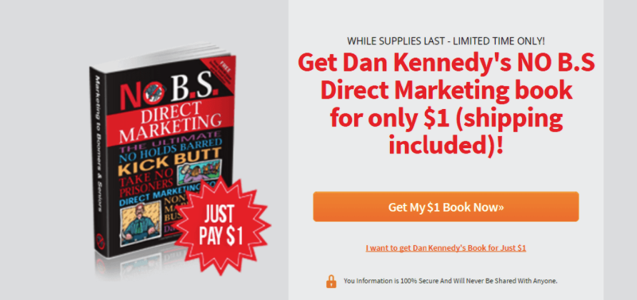
Could you convert someone without a proper call to action? Well, most probably not. CTA is one of the most critical elements of a converting landing page.
First things first. Avoid the word “Submit” at all costs! Find something more bright, persuasive, appealing to turn a prospect into a lead.
Remember that nine out of ten users will read your CTA. And now imagine what happens if it won’t grasp their attention. They will go anywhere else. It’s sad but true.
Respectively, spend enough time to create multiple variants of the CTA. If your budget allows it, A/B test some of them and pick the best converting one.
One important tip we’d like to share with you is personalization. Did you know that personalized CTAs show 202% better conversion compared to generalized CTAs?
All-in-all, now everything is connected with an outstanding UX. Plus, remember about the emotional commitment we’ve talked about.
See for yourself. Imagine you are buying the first lesson at a ballet school for your daughter. What button are you going to hit “Buy Now!” or ”Pay Now!” or “Open a Ballet for Your Ballerina!”?
Right now, let’s jump to some examples of great and so great CTAs.
YES.
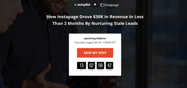
We enjoy how Instapage & Autopilot present the CTA button. It’s bright enough to pop out. But what’s more important, it appeals right to the customer offering to save his/her spot. Remember, emotional connection and personalization are vital.
This landing page’s CTA is also appealing. Firstly, customers can easily discover it. Secondly, it creates urgency by adding “now” and prompts users to make the purchase here and now. Also, it personalizes the offer by putting “my” to it.
NO.
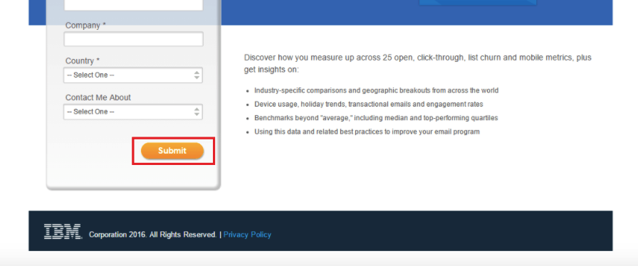
IBM went with the generic CTA “Submit,” which we recommend not doing. Yes, the button is bright enough to be noticed. Yet it’s better to reconsider the message.
Conclusion
As you can see, a high-converting landing page creation requires a complex approach. You need to fine-tune a variety of elements to make everything work.
Yet all this hard work pays off. Landing pages help you present new products or new features in the best way possible. The main thing is sticking to some essential rules.
Make sure to consider seven elements of the high-converting landing page when you are building one. Moreover, don’t forget to A/B test it to achieve the highest conversion rate possible.
Share your thoughts about landing pages! Do you use them as a part of your content marketing strategy? Or are you only planning to employ one? Leave your comments below, and let’s discuss.
All trademarks, logos, images, and materials are the property of their respective rights holders.
They are used solely for informational, analytical, and review purposes in accordance with applicable copyright law.