8 Steps to Increase Conversion on a Homepage
A wish to increase conversion on a homepage is a natural desire of a business owner. In a paradigm where everyone fights for the customer’s attention, it’s understandable. While it’s also not the easiest task, you can still increase the conversion rate.
First thing first, you have to understand that the usual site conversion rate is only 2.35%! Only the top sites reach an 11% mark.
Not that much, to be honest.
Yet, you should not give up. In this article, we did our best to gather eight essential elements of the high-converting homepage. Moreover, you’ll see some examples of dos and don’ts to provide a top-class experience to your users.
1. Start from the headline
Some may compare the first window of the homepage with an elevator pitch. That means you need a short, concise copy to grab the user’s attention.
Creating the proper heading can improve the conversion rate impressively. Fail to do this, and expect high bounce rates.
But what is the anatomy of the excellent heading for your home page?
What you have to understand is that the heading should reflect what you offer. It’s a sneak peek at the whole landing page. So, you can show:
- what your company is about,
- what to begin with,
- why your company is worse trusting.
Also, content marketing guru Neil Patel recommends creating a heading that meets the needs of 20% to 35% of your target audience.
So, you have to target clients who are most likely to try out your product or service. It’s pointless to fit the needs of everyone. It may wash out your message and result in a much lower conversion rate.
Don’t forget to add your strong sides or unique selling points to your headline.
Another vital thing to remember is that you shouldn’t stop on three heading options. Write 10, 15, or, better, 20 variants. Show them to your team or even some loyal customers.
Save two or three best options. Later, you can use them for the A/B test.
See how to create a high-converting landing page and get more leads!
2. Keep it clean
When you think about how to increase the conversion rate, remember to keep your homepage clean. This formula works for both copy and design.
Copy
So, your goal is to support customers in what they are searching for. Employ the homepage to describe the most important sides or features of your business. Don’t overwhelm users with tons of information.
As some products require lots of explanation, it’s better to transfer them into separate pages.
Every section of your homepage should be a continuation of the heading and give a general idea about your business. To make your landing easy to follow, use H3 and H2. That allows building a structure logically.
Also, try not to throw some generic promises or messages to your clients. They are tired of them! So, don’t go over cheesy claims again.
It’s better to think about how to improve or give a second wind to familiar phrases.
Another element of a high-converting homepage is the value you offer. There are so many substitute products! Customers must know why choosing your brand will be beneficial for them.
Design
A user requires only 0.05 seconds to make an impression about a site. That’s how much time you have to persuade a customer to stay on your homepage.
What’s even more impressive is that 75% of users judge a brand’s credibility based on its website design. And most of the impressions will be connected with the design!
So, ensure your layout is in line with modern tendencies and requirements.
Avoid too bright colors, low-quality images, and slow-loading elements. Choose color schemes that fit your industries. Ensure that users can get the information easily and nothing bothers them.
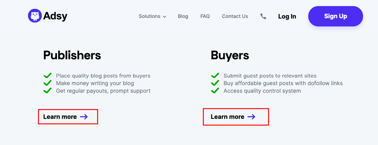
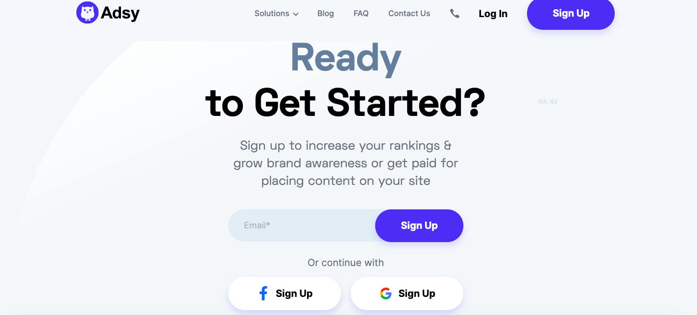
3. Mind sign-up forms
Would you like your website conversions to be high? Then work precisely with sign-up forms.
It’s most likely that your homepage will have one or two forms. Well, at last, customers who fill in the forms provide you with the conversion. So, how do you ensure you get a lead?
Don’t make the forms too long.
That’s probably the main mantra you should have. Yet, let’s throw some more details into it.
Long forms are what often deeply cut the conversion. So, keep them short enough. The most optimal forms are the ones with the fields for the customer’s name and email address.
Of course, we understand that sometimes you need a bit more data. Yet, try to find the perfect balance. This way, leave enough fields to let the sales team close the deal and users feel comfortable with the form.
4. Avoid distractions
So, we’ve already mentioned that it’s essential to keep your homepage clean.
Do you want to boost conversions? Then get rid of all distractions.
Include only what’s vital on your main landing page. Accordingly, let people know what they’d like to see. Your key sections may include:
- The first window with a heading and form,
- USPs (unique selling points),
- Main benefits,
- Testimonials,
- Videos/Images,
- One more form with CTA.
Support each section with a clear copy. Here, usually, less is better. Don’t try to cast out all information about your product at once.
Unfortunately, there is no one-size-fits-all solution. Yet, there is a tip for you. Study a homepage click map.
As you A/B test it, play with the blocks you include. Then look at the heatmap and decide what sections are unnecessary.
that’s a definite DON’T example
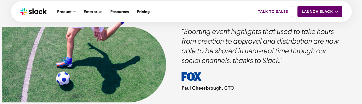
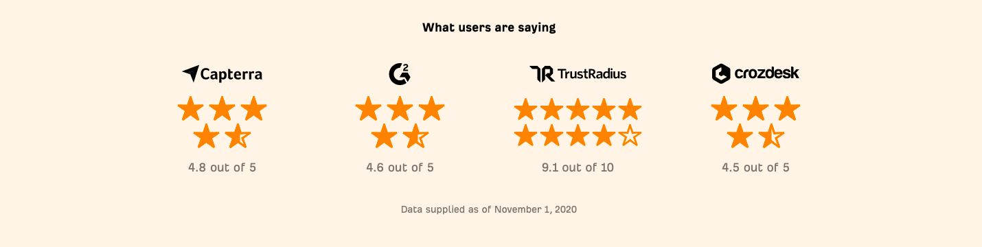
5. Include testimonials or reviews
If you think that reviews can’t help with conversion on the website, you are wrong.
Let’s take a look at some related data:
- 92% of B2B shoppers are more likely to buy after reading a trusted review.
- Users are ready to spend 31% more on a brand with excellent reviews.
- 72% of customers will take action only after reading a positive review.
Now we hope you understand that testimonials can help you convert customers. There are various solutions you can employ.
You can use a block with logos of companies that trust your brand. Also, these might be testimonials from renowned brands. Another option is to embed or add reviews from customers who have experienced your products or services.

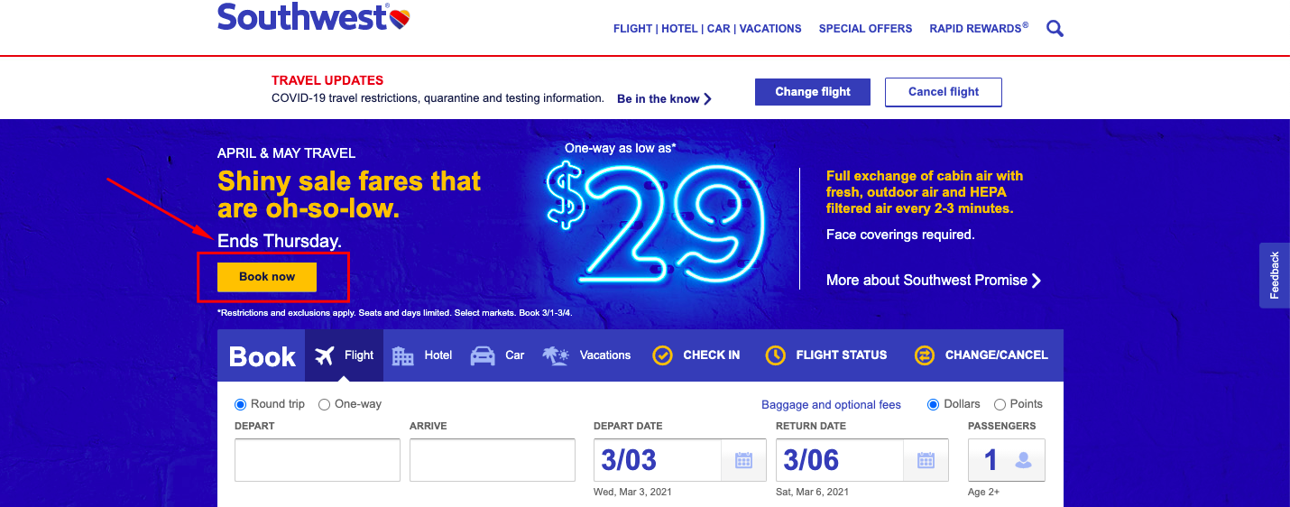
6. Create a strong CTA
The core of growing conversion rates is CTA. That’s how you can control and route the customer’s journey.
Perhaps, one of the important things you have to remember is that only you can ensure a top-class experience.
With that said, it’s not that customers don’t want to buy your product. They simply might not know how to do this.
Your goal is to create a clear, engaging, and persuasive call to action. Once again - it does not matter how beautiful your homepage is. It’s almost useless without a proper CTA. So, work on it.
Often, your first CTA appears on the first window next to a heading or sign-up form. Communicate a plausible message and make the CTA visible and detectable.
And don’t forget about personalization. According to Hubspot, personalized CTAs have 202% better conversion.
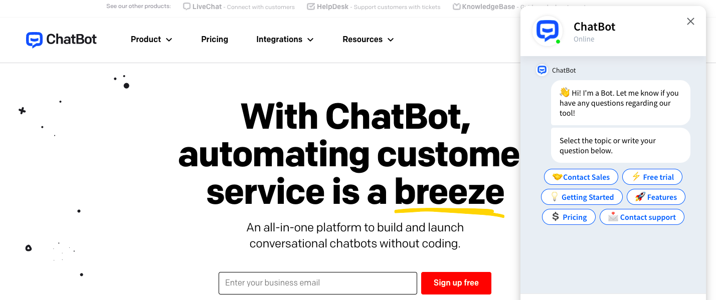
7. Improve conversion rate by adding a chatbot
Are you still thinking about how to find the conversion rate rising? Then add a chatbot on your homepage.
Some marketers consider chatbots irritating. Yet, this opinion is often false.
- 87.2% of users rate their standard chatbot experience from neutral to positive.
- 41.3% of customers stated they used chatbots for buying.
This way, a chatbot can help to provide a more complete and personalized user experience. Allow your users to receive additional information about your product. Offer answers to the most common questions.
Thanks to this easy and fast communication, your potential customers receive additional information. Moreover, you can sell straight through the chatbot. That's what helps your site convert better.
8. A/B test your homepage
A/B testing is a really complex process. Yet, you need one to prove your hypothesis.
Before running a test, you need to have some primary data. So, use optimization tools to get the heat-, and scroll maps. Also, it’ll be helpful to employ overlay and list reports. They will give you a deeper understanding of how your clickable elements are performing.
After this, you can build a hypothesis.
But what are you going to A/B test? Most probably, you’ll proceed with an older version of your homepage and the one with upgrades.
As you have tested both versions, you can make a decision based on the chosen parameters. This way, you upgrade your homepage to serve the goals you have.
Indeed, most business owners want to receive enough clicks on CTAs and convert users. So, to ensure worthy sales conversions, start testing the homepage.

Conclusion
If a person looks at the shop-window and doesn’t like what it shows, he passes a store by. The same logic applies to the homepage of the web store.
That’s how customers make the first impression of your business. So, your goal is to grasp their attention and persuade them to use your product. Of course, it’s not the easiest task to do.
Today, we’ve tried to gather the essential homepage elements to help you convert users.
Apply them and other parameters you consider vital to building a high-converting homepage.
Because what are conversions after all? It’s a sign that you’ve done everything right with your homepage, and it’s working great.
How effective is your homepage? What tactics do you use or want to try to get a higher conversion rate? Share your thoughts in the comments.
All trademarks, logos, images, and materials are the property of their respective rights holders.
They are used solely for informational, analytical, and review purposes in accordance with applicable copyright law.