
Website KPIs Every Business Should Track to Drive Online Success

Your website is where discovery turns into action — but only if you know what’s happening behind the clicks. That’s where website KPIs come in. They translate anonymous traffic into insight you can use.
In this guide, we’ll unpack the metrics that help diagnose growth blockers, conversion gaps, and content wins. You’ll see practical examples that make the numbers easy to interpret.
Use this material to separate vanity stats from true metrics for website performance, so your reporting actually drives action. Better numbers, better decisions.
Why site KPIs matter more than ever
Your website might look great, but looks don’t convert — performance does. Design can win a first glance, indeed, yet only clear website success indicators reveal whether visitors stick around and buy. When leaders finally ask what is KPI in web analytics, they start treating data as the real homepage.
A recent HTTP Archive study found that 74% of mobile sites and 97% of desktop sites now meet Google’s interactivity threshold — the benchmark that measures how quickly a page becomes responsive to user input, typically requiring a first‑input delay of under 100 milliseconds.
If that isn’t proof that teams who focus on speed and stability reap user‑experience gains, what is? Those numbers underline why website KPIs are more than technical trivia; they’re revenue signals.
Before diving deeper, here’s a quick map of the data you’ll see:
- Acquisition signals show who’s arriving and how: traffic sources, click‑through rate, new vs returning visitors.
- Engagement depth reveals content stickiness: pages per session, average session duration, scroll depth, and exit rate.
- Outcome metrics tie behavior to revenue: conversion rate, form abandonment, and cost per conversion.
- Experience & performance checks guard usability: load time / page speed, mobile vs desktop traffic, Core Web Vitals.
Why does this matter now? Privacy shifts are hiding third‑party insights, making first‑party KPIs to measure website performance essential.
At the same time, AI tools can turn raw logs into instant recommendations, but only if the logs capture the right webmetrics performance details.
Pro tip: Treat each metric in our guide as a conversation starter, not a dusty report, and you’ll spot small fixes that unlock big gains.
Top website KPIs defining digital success in 2025 and beyond
Below, you’ll see a detailed walk-through of the key website metrics driving online success today and in the near future. You'll also find handy examples of the best practice of how to improve each KPI and the pitfalls to avoid along the way.
Pages per session
A single-page view tells you someone showed up. Multiple pages in one visit hint that they actually cared. That’s why pages per session sits near the top of many KPIs for websites dashboards.
Think of it as the “curiosity score.” The higher it is, the more your content paths invite exploration, which usually boosts website traffic quality.
What it means and why it matters
Pages per session counts the average number of pages a visitor views before leaving. A rise suggests stronger navigation, clearer calls to action, or topics that connect.
Because it reflects on‑site curiosity, this site success indicator often correlates with time on site and, eventually, conversions.
A dip, on the other hand, can flag thin content or confusing UX. Keep an eye on device splits; mobile numbers tend to be lower due to smaller screens.
How to track it
Most analytics tools log the indicator automatically, so start with Universal Analytics (UA), or a more capable tool — Google Analytics.

Source: LinkedIn
All tools allow filtering by traffic source to see whether email, search, or social visitors explore more pages. You can also set up a segment for new vs returning users, as patterns differ, and both matter.
How often should you check? Weekly for campaigns, monthly for baseline trends. Watch for changes after a redesign or new content hub launch — it’s an early signal of impact.
How to improve this metric
Here are some practical actions you can test:
- Add contextual internal links at natural reading pauses.
- Create short, actionable summaries that entice users to click deeper.
- Use related‑post widgets to surface helpful next steps.
- Trim navigation labels, so options feel obvious, not overwhelming.
Implement small tweaks first, and let’s see if you can gather quick wins. Moving all at once may seem like a solid strategy, but stacking multiple changes makes root‑cause learning harder.
Common pitfalls to avoid
Beware of these frequent mistakes others make:
- Forcing extra clicks with pagination tricks (users notice).
- Obsessing over the abstract number while ignoring real conversions.
- Forgetting to exclude bots that inflate counts.
- Comparing pages per session across wildly different content types.
Treat pages per session as one online performance indicator, not the only scoreboard. Pair it with the exit rate and average session duration for a fuller story.
Average session duration
Visitors rarely announce, “I’m engaged!” They simply linger. Average session duration captures that quiet commitment and sits among the most telling key website metrics.
What it means and why it matters
Average session duration measures the time users spend on your site per visit. Longer sessions often hint at content value, clear navigation, and a friction‑free landing page experience.

Source: Goodfirms
Because it’s a time‑based KPI, it pairs well with bounce rate for a deeper story.
What does it mean when you see a low average session duration on your website? In most cases, it points to thin information or slow load times, which is why people bounce away quickly.
Remember: not every business needs marathon sessions — e‑commerce checkout flows should be smooth, not endless.
How to track it
Open Google Analytics 4 (or GA360 if you subscribe to this paid version), head to Reports → Engagement → Sessions. The figure you are looking for appears next to Engaged Sessions. Note both the median and the average — outliers can skew things.
Segment by acquisition channel to see which campaigns deliver quality over quantity. Organic search might stay longer than paid social clicks.
Set an annotation when you redesign a landing page or publish a content hub. That timestamp lets you spot cause and effect.
How to improve this metric
This is one of the trickiest KPIs to boost, as for many, it seems like an easy one, but in reality, it may take a while. Start with these proven tweaks:
- Tighten (edit, proofread, and simplify) copy and add clear subheadings for easier scanning.
- Insert internal links that expand on key ideas (but not too many links!).
- Use embedded video or audio to hold attention.
- Remove intrusive pop‑ups that break reading flow.
Small refinements will compound, and weekly monitoring should reveal gradual lifts over time.
According to the survey conducted by Goodfirms, the most effective tactics to improve average session duration include: making one’s content interactive (36% of respondents), improving internal linking (23%), and improving copywriting (18%).

Source: Goodfirms
Common pitfalls to avoid
Now, when it comes to the common pitfalls (and that’s why we called this KPI tricky to achieve quick gains), watch out for these traps:
- Counting idle browser tabs as engagement inflates session duration and misrepresents actual user interest.
- Focusing only on longer sessions while conversion rates remain flat, which misleads performance evaluation.
- Ignoring mobile performance, which can chop seconds fast.
- Forgetting server latency, which often inflates or deflates the average session duration number.
Pro tip: Read average session duration alongside other website KPIs — this blog success metrics checklist can help.
Conversion rate
Conversion rate (CR) tells you how many people took the step you wanted—bought, subscribed, booked. It’s the heartbeat of any website key performance indicators dashboard.
What it means and why it matters
Conversion rate is the percentage of sessions that complete a defined goal. It distills traffic quality, messaging clarity, and user experience into one figure.
High numbers prove that pages resonate and friction stays low. This site's success indicator links clicks to revenue faster than most indicators. That’s why marketing budgets live or die by it.
Low rates, meanwhile, point to mixed signals — perhaps an offer that feels vague or a checkout that drags. There could be more reasons than you can imagine.
How to track it
In GA4, create a “Conversion” event for each goal: purchase, form, or phone tap. The platform then divides completions by total sessions automatically.
You can further segment by channel to see which campaigns pay their way.
Heat‑map tools (e.g., Hotjar, Crazy Egg, or FullStory) add context, revealing where users stall. Pair that with funnel reports to pinpoint conversion leaks.
How to improve this metric
Improving conversion rate usually starts with removing friction and clarifying value. Focus first on the highest-traffic, lowest-converting landing pages, as even small usability fixes here can pay off quickly.
Once the path feels clear, test targeted changes and measure the impact before rolling them site-wide.
Start with these focused actions:
- Present your main offer and benefits in the screen’s initial view before any scrolling.
- Ask only for the information you truly need by trimming form fields to the bare minimum.
- Offer visitors trust cues — reviews, security badges, clear shipping info.
Implement one change per test cycle so you know what worked. Small tweaks to copy and layout often lift rates quickly.
Measure each change for at least a week (or until you’ve gathered enough sessions) before judging impact.
Here are some additional tips on how to improve CR:
Source: Capturly
Common pitfalls to avoid
Conversion numbers are easy to misread when context is missing. The issues below regularly distort results or lead teams to chase the wrong fix. Scan for these before celebrating a spike — or panicking over a dip:
- Ignoring mobile-specific hurdles like tiny buttons.
- Comparing high-ticket B2B offers to low-cost e-commerce items.
- Counting every page view as a potential conversion and inflating percentages.
Because conversion rate depends on both completions and total sessions, any skew in traffic mix changes the story. Segment results, confirm tracking accuracy, and always compare like with like.
Pro tip: Treat conversion rate with other website KPIs that show how your site performs, e.g., bounce, exit, and average order value. That will allow you to see the full picture.
Traffic sources
Visitors arrive from search, ads, email, or social — knowing which route they take changes everything. That’s why traffic sources rank high among KPIs for websites; they tell where to invest and where to trim.
If most clicks never reach your landing page, even the best creative can’t shine. Mapping source mix helps you fix that disconnect quickly.
What it means and why it matters
Traffic sources classify visits by origin — organic, paid, referral, direct, and so on. This site's success indicator highlights which channels supply volume versus value.
Uneven mixes can reveal over‑reliance on one campaign or an untapped audience elsewhere.
Understanding source quality also guides messaging; search visitors need answers fast, while email subscribers crave deeper insights.
How to track it
Open Google Analytics 4 and head to Acquisition → Traffic acquisition. The table breaks sessions into default channel groups.
You can add a secondary dimension, like city or device, to spot regional or mobile opportunities.
Also, tag each major campaign launch in your analytics so you can link later traffic spikes to specific efforts.
How to improve this metric
Traffic‑source health is less about chasing big spikes and more about steady variety.
Aim for a channel mix where no single source holds you hostage and each one sends visitors who actually engage. Once that baseline feels balanced, you can layer on growth experiments without risking sudden traffic shocks.
But first, balance channel health before chasing growth:
- Strengthen underperforming organic pages with refreshed content.
- Test new ad creatives to lift paid click‑throughs.
- Bring quiet email lists back to life with focused, segmented outreach campaigns.
- Boost referral traffic by pitching guest articles.
Pro tip: Tune your spend according to authentic channel movements, making subtle budget shifts rather than broad overhauls to protect trend consistency and limit data noise.
Common pitfalls to avoid
Channel breakdowns often mask underlying errors — incorrect attribution, forgotten tags, or expected seasonal shifts can distort the view. Pause before praising growth or fretting over declines, and rule out the following usual culprits:
- Treating branded search and true organic as the same (branded search reflects people already familiar with your name, while true organic comes from new prospects — mixing them hides how well you’re attracting fresh visitors).
- Forgetting UTM tags, causing paid clicks to land in “direct.” Without those tags, analytics can’t distinguish your ads from generic visits, so it misattributes valuable campaign traffic as direct.
- Ignoring seasonality, as some channels naturally swing. The point is that seasonal peaks — like holiday shopping or industry events — can create spikes that aren’t representative of ongoing performance, so you need to compare like with like.
- Overvaluing vanity traffic that never converts. High volumes of visitors who only glance and leave without taking action can inflate your numbers while doing nothing for leads or sales.
Pro tip: Pair traffic‑source data with other data that shows how your site performs (like conversion rate) to see the full impact. Cross‑checking numbers keeps you from fixing what isn’t broken or missing problems hiding in plain sight.
New vs returning visitors
First‑time visitors widen your reach, while repeat visitors prove you delivered value worth another click. Knowing how those two groups balance out helps you plan content, ads, and retention programs with confidence.
Among the key website metrics, this split tells you whether you’re attracting new eyes or nurturing an existing fan base.
In essence, this KPI works like a loyalty meter. Too many newcomers and no returners may signal one‑off curiosity without stickiness. On the contrary, too many returners and no newcomers can stunt growth.
What it means and why it matters
New visitors are newcomers who’ve never logged a session under their current browser and device. Returning visitors have been counted before and chose to come back.
A healthy ratio varies by business, but most teams aim for steady renewal alongside rising loyalty.
This site's success indicator can also surface marketing gaps: heavy ad spend often spikes new sessions, while strong email tactics raise repeat visits.
How to track it
The all-mighty GA4 will show you the split under Reports → Retention. The chart you’ll see compares “New users” with “Returning users” for any date range.
For an in-depth analysis, consider layering a secondary dimension like channel or campaign to see which efforts drive each cohort.
Finally, export monthly data to watch long‑term shifts and tie them to promotions or product launches.
How to improve this metric

Source: Gravitec
Balancing newcomers with loyal followers usually comes down to two levers: discovery and retention. Discovery brings in fresh faces through search, social, and referrals. Retention persuades those faces to come back by offering ongoing value and clear next steps.
Here are some practical tactics to balance both groups:
- Refresh top‑ranking articles with up‑to‑date facts to lure fresh search traffic.
- Provide custom content or product suggestions based on user history to drive repeat visits.
- Schedule a sequence of value-packed emails aimed at bringing recent visitors back.
- Finally, prepare and offer member‑only resources to keep loyal readers constantly engaged.
Pro tip: Monitor the ratio after each change; a small swing can reveal what resonates.
Common pitfalls to avoid
A balanced user mix means little when technical bugs, shifting targets, or tunnel vision on one group skew your understanding and actions.
Therefore, watch for these frequent errors:
- Counting every device swap as a new visitor, skewing totals.
- Ignoring cookie consent issues that underreport repeat traffic.
- Using one benchmark for all pages, when blogs and product hubs behave differently.
- Over‑optimizing for new users and letting loyal ones churn unnoticed.
As with many other key indicators, the rule of thumb is to read this split alongside other website KPIs that show how your site performs (e.g., average session duration and conversion rate) for a complete retention picture.
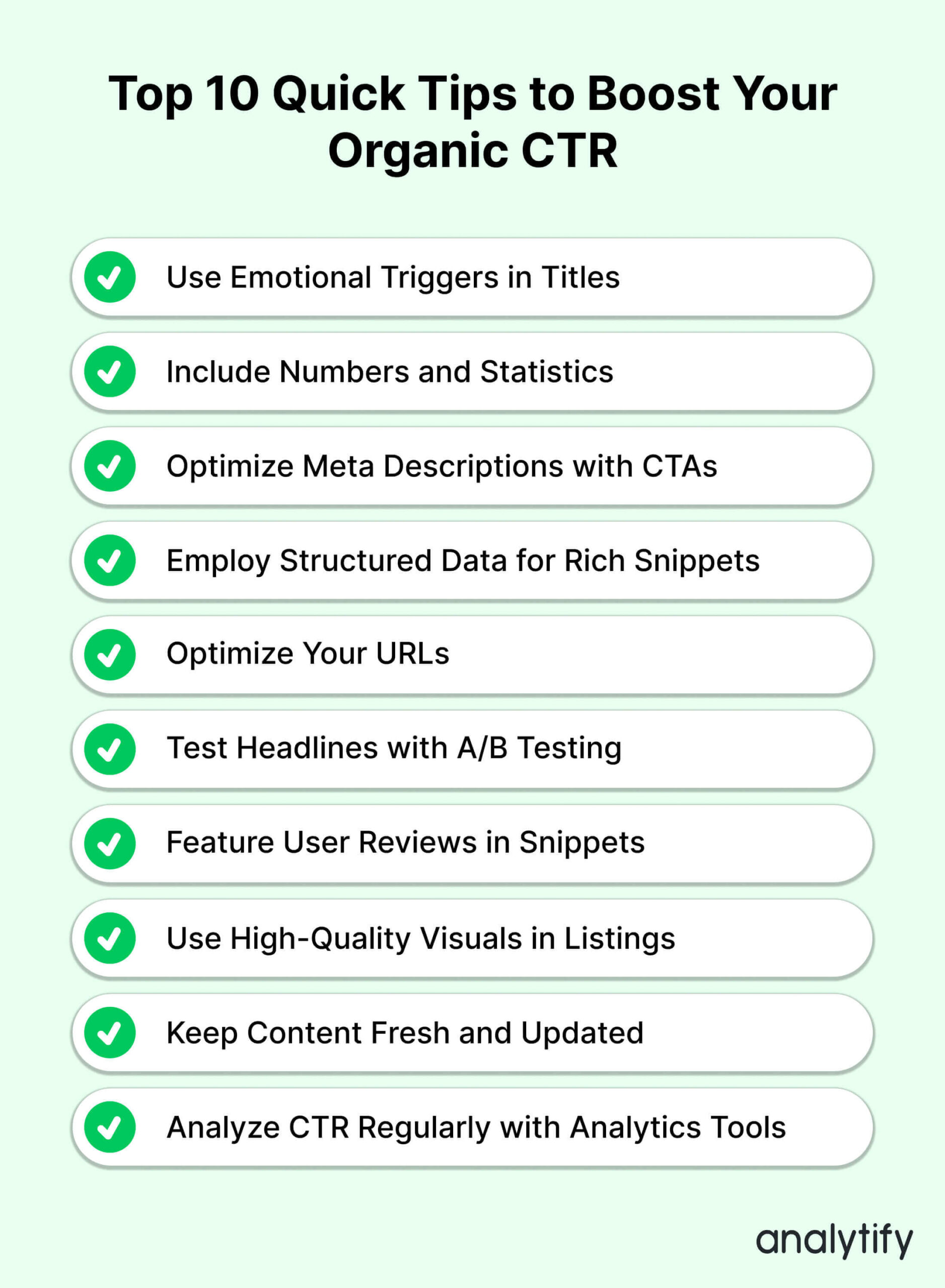
Click-through rate (CTR)
A headline or button means nothing unless someone clicks it. CTR measures that moment and turns curiosity into action. It’s often one of the first metrics for website performance teams watch for because it influences everything else.
In a world of endless feeds and AI-made graphics, attention is scarce. High CTR shows your message won the microsecond contest.
Marketers cite it in campaign recaps, analysts fold it into webmetrics, and even a casual reader of your blog can grasp its meaning.
What it means and why it matters
CTR is the ratio of clicks to impressions, expressed as a percentage. It reveals how compelling your copy, design, and placement are in context.
A higher rate means each view costs less (or earns more), stretching budgets and boosting reach.
Because it sits at the top of the funnel, this vital site parameter often predicts whether a campaign will meet its conversion goals.
How to track it
Google Ads, Search Console, and most email platforms calculate CTR automatically. You only need to divide clicks by impressions and multiply by 100.
In GA4, which we cite extensively in our guide (because it is in fact the go-to tool for webmetritcs) use the “User engagement → Events” report to watch internal CTAs. Add event parameters for more granularity.
Additionally, you can segment by device and channel. Mobile users skim faster, so their CTR benchmarks differ.
How to improve this metric
Boosting CTR begins with making the offer impossible to overlook. Clear value, strong visuals, and tight message‑match all raise the odds that a distracted user will click instead of scroll past.
Tackle the basics below before moving on to more advanced tests:
- Rewrite headlines to promise a clear benefit.
- Test contrasting button colors against the background.
- Align ad copy exactly with blog post titles.
- Place CTAs above the fold for busy readers.
Source: Analytify
Common pitfalls to avoid
CTR can look healthy while hiding deeper problems. Misreading the website KPI or forgetting the context behind it often leads teams to tweak the wrong levers.
Hence, keep the following traps in mind whenever you review click data:
- Judging CTR without checking post‑click bounce rates.
- Comparing display ad CTR to search ad norms.
- Letting ads show on low‑quality sites inflates impressions and drags CTR downward.
- Forgetting seasonality — holiday ads often skew high.
Pro tip: Check session duration alongside CTR to confirm visitors stick around after clicking.
Exit rate
Visitors leave eventually, but where they leave matters. In most website KPIs dashboards, exit rate shows which pages say “good‑bye” more often than “next.” Knowing that spot helps you plug leaks before they drain conversions.
High exits aren’t always bad; the thank‑you page should end a visit. Yet surprise exits on product or blog posts flag friction. Those clues make exit rate an underrated piece of usage metrics.
What it means and why it matters
Exit rate calculates the percentage of sessions that finish on a specific page. It answers, “Is this page the last stop more often than expected?”
As a KPIs for website indicator, it pairs naturally with bounce rate, but the two differ — exit looks at any point in the journey, not just the first.
Spotting pages with unusual exits reveals confusing copy, missing next steps, or slow load times.
How to track it
In GA4, open Engagement → Pages and Screens, then add the value “Exits.” Sort by exit percentage to find extremes.
There is an option to segment by device and channel. Watch out, as mobile users may quit sooner on heavy pages, and paid visitors behave differently from organic.
Add annotations for site changes so you can link exit spikes to design tweaks or campaign launches.
How to improve this metric
Lowering an unjustified exit rate usually comes down to giving visitors an obvious next step and smoothing out any friction that nudges them toward the close button. Think of this phase as tidying a hallway: you point out the doors you’d prefer people use and clear anything that blocks the path.
With that mindset, focus on small, targeted tweaks first — they’re quicker to measure and easier to roll back if they miss the mark:
- Add a clear call‑to‑action near the natural scroll end.
- Place an internal‑link to related content, so readers have a next step.
- Trim heavy media that slows page load.
- Use breadcrumb navigation for easy backtracking.
Common pitfalls to avoid
Exit numbers can tell very different stories depending on page purpose, traffic volume, and user intent. Misreading them — especially when you don’t consider where the visitor is in their journey — can lead to costly or time‑consuming fixes that don’t solve the underlying issue.
Keep the following pitfalls in mind before declaring any page a “leak”:
- Treating high exits on confirmation pages as problems.
- Confusing exit rate with bounce rate and double‑counting issues.
- Ignoring sample size — pages with few visits give noisy percentages.
- Comparing long‑form articles with short help docs.
Pro tip: Review exit pages alongside on‑site survey feedback to capture visitor intent and frustration.
Load time/page speed
Speed is silent until it’s gone — then everyone notices. That silent factor remains one of the clearest KPIs for websites, especially when measuring first‑impression quality on a landing page.
Users reward fast sites with longer sessions and repeat visits, marking page speed as a critical site success indicator.
What it means and why it matters
Load time is the delay between a click and a meaningful content display. Search engines treat it as a ranking signal; shoppers view it as a trust cue.
Google research found that when a mobile page’s load time grows from 1 second to 3 seconds, the probability of a visitor bouncing rises by 32%. In practice, every millisecond saved lowers abandonment risk, particularly for mobile carts.
Fast pages also reduce crawl budgets, helping more URLs get indexed.

Source: ThinkwithGoogle
How to track it
The fastest way is by combining Lighthouse audits for lab tests with GA4 real‑user metrics for field truth.
Furthermore, you can monitor server response time in your hosting dashboard; backend slowness undermines frontend wins.
Define performance thresholds in your continuous integration (CI) pipelines to prevent new code from slowing pages down.
How to improve this metric
Shaving seconds off load time rarely requires a full site rebuild; most gains come from a handful of well‑chosen tweaks. Focus first on elements visitors see or download on every page — large images, bulky scripts, and server responses.
Each fix below targets a common bottleneck that can be measured immediately after deployment:
- Compress and resize hero images for each breakpoint.
- Enable GZIP or Brotli compression on the server (This tells your server to shrink files before sending them, so browsers can download and render pages more quickly).
- Replace heavy sliders with static images.
- Adopt minimal, system‑default fonts before custom ones load.
Pro tip: Prioritize in‑viewport content by loading it first, then lazy‑loading everything else to speed up perceived performance.
Common pitfalls to avoid
Speed projects can backfire if you optimize for lab scores instead of real readers, or overlook behind‑the‑scenes scripts that silently add seconds.
For that, keep an eye on the issues below so your hard‑won performance gains don’t vanish with the next code push or plugin install:
- Chasing perfect scores instead of real‑world performance.
- Loading analytics tags synchronously, which blocks page rendering and delays content visibility (hurting user experience).
- Neglecting third‑party widgets like chat and ads.
- Testing on wired connections only, ignoring 3G scenarios.
Pro tip: Compare page‑load times against conversion rates on your checkout and sign‑up pages to see which delays hit revenue.
Mobile vs desktop traffic
Mobile and desktop visitors behave differently, so lumping them together blurs the real story. For teams tracking website KPIs, knowing each group’s share (and especially how they convert) guides design, content, and ad spend.
As an example, your blog may draw heavy mobile skimmers, while desktop users linger on resource pages.
What it means and why it matters
This split shows the percentage of sessions from handheld devices versus larger screens.
A rising mobile share means you should prioritize thumb‑friendly layouts and lighter pages.
On the contrary, a desktop‑heavy audience may favor deeper research tools and wider layouts.
As you can see, it all comes down to device-dependent user preferences. Including this metric among KPIs for website planning helps you see where UX efforts pay off fastest.
How to track it
GA4 lists “Device category” under Tech reports, displaying data for mobile, tablet, and desktop. By layering dimensions like channel or city, you can see where each device dominates.
Make yourself a rule to monitor these trends continuously. When you detect an unexpected jump, it often means that a search‑algorithm change has happened.
Treat the ratio as one of your broader website key performance indicators to keep context clear.
How to improve this KPI
Improving device mix takes intention. In most instances, your work will be focused on customizing layouts based on screen size. Identify key pages where phone and desktop behavior diverges (like checkout or FAQs), then roll out the following targeted tweaks that only take days to roll out:
- Optimize font size and tap targets for mobile thumbnails.
- Surface live chat on desktop product pages where buyers research longer.
- Use responsive images, so each device downloads an appropriate size.
- Offer click‑to‑call buttons on mobile checkout pages.
Review bounce and conversion shifts after two weeks to confirm impact, then lock in what works and queue up the next round of experiments.
Common pitfalls to avoid
Interpreting mobile and desktop data can be tricky; the same value often means different things on different devices. Therefore, before reacting to an unexpected spike or dip, check for technical blind spots and mismatched user expectations.
The list below covers the most frequent oversights that skew analysis or waste optimization efforts:
- Assuming mobile users open long PDFs willingly.
- Testing page speed on desktop Wi‑Fi only.
- Forgetting that email previews differ sharply across devices.
- Treating tablet data as interchangeable with phones or laptops.
Pro tip: Create separate analytics segments for each device type so you always compare apples to apples.
Cost per conversion
Marketing budgets live or die by key website metrics, and this KPI tells you exactly what every sale or signup really costs. It’s the bridge between flashy campaigns and actual profit.
Among website KPIs, cost per conversion (CPCV) answers the blunt question: “Are we paying too much to win new business?”

Source: Priceva
What it means and why it matters
CPCV divides total spend by the number of completed goals, such as orders, demo requests, or subscriptions. M+R’s recent nonprofit study shows organizations spend just $0.14 on ads for each online revenue dollar, proving tight control is possible even with modest budgets.
What do fluctuations in this parameter mean? A climbing CPCV signals rising ad prices, creative fatigue, or tracking leaks. Conversely, a falling CPCV usually aligns with better targeting and sharper offers.
How to track it
Pull ad spend and conversion counts from your ad dashboards, then verify in web analytics (the common GA44 or GA360 are our top recommendations for that job) to ensure post‑click actions are firing.
In GA 4, for example, you can track CPCV by channel — paid search, social, display — to see which source pays its way.
Be advised that sudden jumps in this indicator often follow bid‑strategy tweaks or algorithm changes.
How to improve this metric
Lowering cost per conversion usually means squeezing out wasted spend while nudging more visitors to complete the goal.
Before diving into major campaign overhauls, tackle quick, high‑return fixes you can measure within a single billing cycle. Start with the levers that directly affect ad relevance, user experience, and bid efficiency:
- Tighten audience targeting to cut wasted impressions.
- Update your ad visuals and copy every two weeks to maintain audience interest and prevent message fatigue.
- Optimize home pages for faster load and clearer value.
- Enable smart bidding that respects a hard cap on cost per acquisition, keeping expenses predictable and controlled.
Pro tip: Layer in offline data (phone orders, in‑store purchases) to capture full conversion value and avoid underestimating true costs.
Common pitfalls to avoid
Cost‑per‑conversion can be deceptively simple: spend divided by wins. Yet misleading tracking choices or one‑size‑fits‑all comparisons often hide the real story and waste budget.
Keep the following watch‑outs in mind before you celebrate a low figure or panic over a spike:
- Counting micro‑conversions (e.g., scroll depth) as full conversions.
- Ignoring lifetime value, as cheap leads can still lose money.
- Letting high‑cost brand terms inflate blended CPCV.
- Comparing B2B trials with e‑commerce purchases in one pot.
Pro tip: Exclude test and internal traffic via IP filters, so trial runs don’t skew real cost calculations.
Scroll depth
Understanding how far visitors scroll is one of the clearest metrics for website performance because it shows whether people actually reach your best content. It’s important for long articles, landing pages, and product stories where readers must scroll past the intro to find the main benefits.
What it means and why it matters
Scroll depth tracks how much of a page a user visually reaches, expressed as a percentage. As a behavioral KPI, it reveals whether headlines hook readers and whether section breaks keep them moving.
High depth on an FAQ page signals questions answered; low depth on a pricing page might suggest hesitation.
Pairing depth with dwell time helps separate quick scanners from truly engaged readers.
How to track it
Most analytics tools these days offer a scroll‑tracking plugin or built‑in feature. In GA4, for instance, you can set a custom event at 25%, 50%, 75%, and 90% of the page height that a user has viewed.
Export the report weekly and split by device; mobile users often scroll differently than desktop visitors. Heat‑map tools (most will do) give a visual overlay, showing exactly where attention fades.
How to improve this metric
Improving scroll depth is mostly about making the page feel lighter and more rewarding as the reader moves downward.
Start with these reader‑friendly tweaks:
- Break long text into short paragraphs and subheadings.
- Insert images or pull quotes every 300–400 words to reset attention.
- Add a progress bar, so users see how much is left.
- Place a teaser of the bottom‑section value near the top.
Common pitfalls to avoid
Scroll depth can be deceptively optimistic (or pessimistic) if you don’t account for layout length, device quirks, and auto‑scroll glitches. Treat the numbers as general guidelines, not the ultimate truth, and keep the following snags on your radar:
- Comparing scroll depth across pages with vastly different lengths.
- Triggering auto‑scroll events that inflate numbers.
- Ignoring device differences — thumb scrolling is faster.
- Treating 100% depth as success when the footer is short.
Pro tip: Break out scroll depth by user segment — new vs. returning — to see who really engages.
Conclusion
Measuring website performance must precede any big or small optimization actions. The former will give your actions meaning and direction.
Web KPIs are important, and uncontested, indeed. However, there are simply too many website KPIs to track them all at every point in time.
Therefore, in this guide, we’ve cherry-picked and broken down into molecules only the most critical KPIs that will keep your site healthy and your goals on track.
Think of the selected KPIs to measure website performance as a concise health chart. Check them regularly, adjust what’s off‑track, and your site will stay ready for the next growth push.
All trademarks, logos, images, and materials are the property of their respective rights holders.
They are used solely for informational, analytical, and review purposes in accordance with applicable copyright law.