How to Reduce Bounce Rate and Keep Visitors Engaged

Like a ball bouncing off the backboard when you play a basketball game and miss the net, so do visitors bounce off your website. They don’t do anything on your site; rather, they linger for a few seconds and then leave abruptly.
The bounce rate is bad, there is no doubt about it. However, it is not the rate per se that’s bad, but rather the high rate of those who leave your website.
You see, bounces occur naturally, and maintaining a zero bounce rate is unrealistic; virtually no one can get rid of it completely. But keeping it reasonably low is absolutely doable and should be a priority for every site owner.
Today, we explore several tried-and-true strategies that help keep visitors engaged and minimize the percentage of those who bounce. You’ll learn how to reduce bounce rate on your main website, blog, landing page, or an ecommerce store — the methods presented here are universally effective for all types of web pages.
Ready to enhance your visitor engagement rate? Let’s get to it!
Why bounce rate matters
When people leave your page after a few seconds, that doesn’t only mean that they spoil your statistics. There is more to bounce rate than just percentages; it’s a blow to your reputation, image, trust, and conversion.
A high percentage of those who bounce off, signals to you that you have something seriously wrong on your central page. Maybe the content is not ideally aligned with the audience's pain points and intent? Maybe the design and CTAs are weak and require immediate action?
It’s a challenge you must put on your high-priority list of things to solve.
The Web Almanac research and data back up the “entry page” challenge. In 2024, they found that secondary pages passed Core Web Vitals far more often than homepages (51% vs. 38% on mobile; 61% vs. 45% on desktop). This discovery indicates that many first-touch pages are heavier and shakier, which nudges immediate exits.
To interpret the metric correctly, separate cause from location. In Google Analytics 4 (GA4), bounce is about sessions that never become engaged; exit rate is about the page where any session ends. Different questions, different fixes.
The success of fixing the bounce problems depends on your ability to find answers to the core questions you’ll need to ask when “one-and-done visits” spike:
- Who’s landing here? Find the source, device, and intent profile.
- What did we promise? E.g., title/snippet vs. on-page answer.
- What’s visible first? Does the fold show value and direction?
- Where do they go next? If nowhere, is that by design?
Use site abandonment to audit your entry points, not just your content topics. And get the definitions straight, so teams speak the same language.
For example, GA4’s bounce rate = sessions that are not engaged; an engaged session is 10+ seconds, 1+ key events, or 2+ page/screen views. Exit rate further identifies where people leave after they’ve already explored.
Finally, treat visitor drop percentage as a lens, not a verdict. It points you to questions worth answering before you change anything.
6 ways to reduce bounce rate and keep visitors engaged
1. Improve website speed
One of the primary reasons why visitors bounce off so quickly is the speed of a website. In the age when 4G and 5G mobile coverage is widespread, everyone expects almost instant load times. A single blink of an eye, and the page must be fully visible with all the details and elements. With only a few seconds of lingering time, and the patience is no longer there; it's better to try another website.
How to ensure your website speed is up to the visitors’ expectations and certainly lower than their bouncing threshold? Actually, there are several things that you can do straight away.
Optimize images and media
Source: Freepik
For most sites, the largest on-screen element is an image. If that image is late, users see a blank or shifting layout and choose drop-off long before the page settles. That’s a straight line to a higher bounce rate.
An image is the LCP (Largest Contentful Paint — one of Google’s Core Web Vitals) element on ~73% of mobile pages and ~83% of desktop pages. In plain English: your hero image is probably the bottleneck, so make it small, discoverable, and prioritized.
Note these quick ways to lighten images and media:
- Use AVIF/WebP with JPEG/PNG fallback via <picture>.
- Compress more aggressively; compare visual quality, not just numbers.
- Serve responsive sizes (srcset/sizes) so phones don’t download desktop assets.
- Add explicit width/height to stop layout jumps.
- Lazy-load below-the-fold media; never lazy-load the hero.
- Defer nonessential videos; start with a poster image.
When the hero paints quickly, visitor drop percentage falls because people can read, orient, and move forward without waiting.
Use reliable hosting and CDN
Hosting can ruin even an otherwise perfect graphics optimization and sound SEO. It’s the foundation of both search engine rankings and user experience, where the bounce rate is just one indicator of many.
Just like in the famous Maslow’s Hierarchy of Needs or the Maslow’s Pyramid, hosting and CDN (Content Delivery Network) sit at the very bottom of the basic needs. If they are not fulfilled, all the overarching needs of, let’s say, attractive site design, perfect content, and link-building, or mobile optimization, make little sense.
So, your hosting sets the pace for everything else. If the server is slow to respond, the page stalls before content even shows, and people choose immediate exits. That’s how a shaky foundation turns into a higher leave rate.
A good host gives you quick Time to First Byte (TTFB), consistent uptime, and resource isolation so noisy neighbors don’t slow you down. Pair that with a CDN that has points of presence near your audience, and assets reach the browser before patience runs out. This combo trims the drop-off rate without touching your website design.
What to look for in plain language:
- Servers near your visitors: a closer distance means faster first response.
- A dedicated or virtual hosting, rather than a slower, shared one.
- CDN with wide coverage: more nearby locations equals quicker delivery.
- HTTP/2 or HTTP/3 + TLS 1.3: modern protocols reduce wait time.
- Brotli compression: smaller files, faster downloads.
- Full-page and object caching: fewer trips to the origin server.
- Origin shield: your CDN protects the host during traffic spikes.
You’ll feel the difference in the first second of load. That’s where many immediate exits happen — fix that window, and more visitors stay to read.
Minimize code bloat and plugins
Plugins are convenient, but each one adds weight, requests, and risk. Conflicting plugins can stall rendering and raise visitor drop percentage. And when the page hesitates, people click away.
Decide what your site must do, zoom in on the absolute must-have list. Then pick the minimum set of tools to do it well.
Also, consider replacing overlapping plugins with one solid choice. Your users will feel the difference in those first seconds, and the exit rate usually falls.
Keep this checklist handy:
- Remove overlapping features; one plugin per job.
- Prefer well-maintained, widely used plugins.
- Turn off modules you don’t need.
- Self-host essentials and avoid third-party loaders when possible.
- Lazy-load widgets below the fold.
- Document what each plugin does.
When you simplify the stack, you simplify the path to content. That clarity reduces drop-off rate without changing your design.
To sum up, chat widgets, analytics, fonts, and A/B tools — they all add to the requests and blocking time. Too many embeds can double the work before your page even starts, pushing up the abandonment rate.
You should keep only the services that truly earn their place. Load the rest after interaction, or not at all, on fast paths like product pages. Your users will notice that the page shows up, not the toolbox behind it.
2. Enhance mobile experience
We’ve touched upon mobile experience in the context of other themes in the previous chapters. However, it's a strong stand-alone factor that has a direct impact on bounce rate. A great mobile experience reduces bounce rate dramatically, as the majority of Internet users these days access sites via mobile devices.
In this chapter, we take a deeper look at the core elements within mobile experience that play the biggest role in lowering visitor drop percentage on small screens.
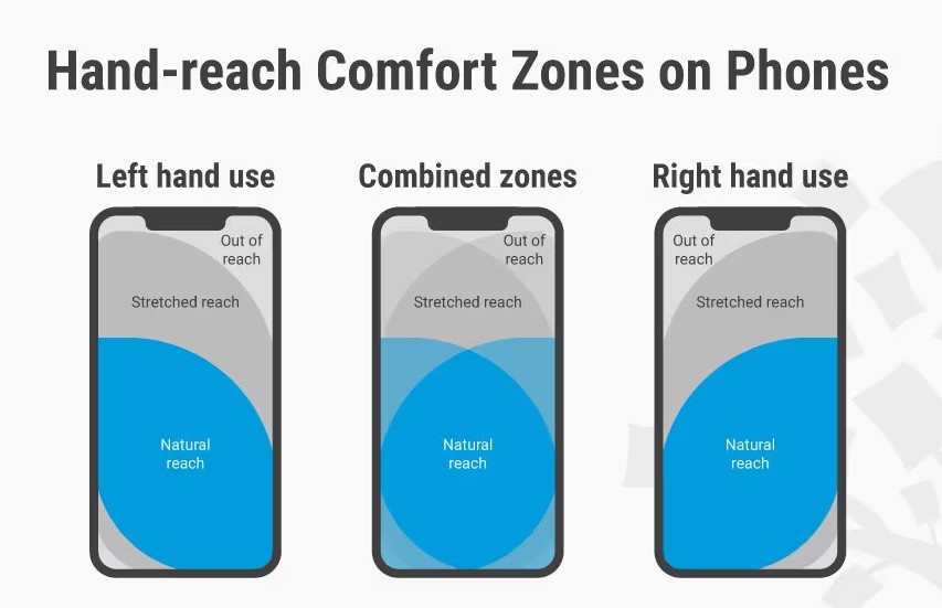
Source: InteractionDesign
Ensure responsive design
Design is such a capacious factor that comprises the wholeness of all elements on one’s site, plus their key characteristics and positioning. These include the copy, the graphics elements, CTAs, videos, and all the interactive parts that should remain usable on any device.
Navigation that demands precision taps will leak visits. Small links and crowded menus increase exit rate, especially on mid-range devices. Responsive nav keeps choices simple and within thumb reach.
Network and device variety are facts, not edge cases. Ofcom’s 2025 report shows mobile users split across 5G and 4G with different performance profiles; standalone 5G is faster, but still only 2% of 5G attempts (non-standalone, i.e., those 5G functionalities that use 4G infrastructure).
What are the implications for a responsive design to reduce bounce rate? It means that if you design your website for a broad baseline, this will keep more visitors on your pages.
If you’re thinking about how to simplify without losing options, start by making the primary route obvious and hiding the rest behind clear labels.
Here are several efficient and mobile-friendly layout moves you can try:
- Use system fonts or well-optimized web fonts.
- Keep images within the content width; no off-screen overflow.
- Reserve space for media to prevent layout jumps.
- Give forms breathing room; label fields clearly.
- Place secondary links after the primary action, i.e., the one thing you most want the visitor to do.
A layout that respects thumbs and time reduces visitor drop percentage. It cannot eliminate the churn completely, but a significant reduction is guaranteed. People stay because the page feels effortless.
Additionally, mind your copy. If text is hard to read, nothing else matters. Tiny fonts and long lines raise the drop-off rate even on fast phones. Responsive typography size, spacing, and contrast — will help you keep your main message effortless.
Simplify navigation for small screens
Intuitive navigation for mobile screens is no longer a desired option; it’s a must-have standard feature. To decrease bounce rate, your page must have a clear path to the one thing that matters most. Don’t forget that on a phone, attention is thin and space is tight. If people need to guess where to tap, immediate exits follow.
Start by deciding the primary action for the page. Everything else should support it, not compete with it. Keep labels short and literal — clever names (unfortunately) slow people down and raise drop-off rate.
Even if it seems to you that you’re not being original and repeating what others write and show, for mobile users, navigation must look and feel natural. Keep that in mind.
Here are some practical ways to simplify mobile navigation:
- Put the primary action first; don’t hide it in menus.
- Use plain labels like “Pricing” or “Contact,” not puzzles.
- Limit top-level choices; collapse the rest.
- Keep the header small and clear; let content take the stage.
- Make tap targets large and well spaced.
- Keep search options easy to find on every page.
When the route is obvious, site abandonment falls. People don’t need a mental map — they need one good sign pointing forward. They’ll linger on your pages for a few seconds longer, which will be just enough to keep them engaged and to make a conversion.
Test across devices
Last, but not least — make sure your design, navigation, and content work equally well for different mobile screen sizes and different operating systems. For instance, a good mobile navigation for a tablet may cause problems on smartphone screens measuring less than six inches in screen diagonal.
Similarly, the design that works flawlessly on Android devices may have small lags and other issues on IOS.
You must have a team of dedicated experts who will be responsible for testing your product across multiple devices. This often requires the necessary competences and processes to be in place, besides taking time. But the effort will be totally worth it, positively impacting your site’s bounce rate and keeping the users actively engaged.
3. Content strategy to reduce bounce rate
In the age of vivid site designs and plenty of interactive elements, content is often underestimated as the engagement factor. Yet, it is the core thing that has the power to keep your visitors actively engaged and to prolong their dwell time on your pages.
If you’re looking into how to reduce bounce rate beyond first and second impressions, look no further than content. This usually requires coordinated strategic efforts and a plethora of relevant techniques.
Create high-value and relevant content
To serve the purpose of reliably holding the visitors on your pages, the content must bring real value and be relevant to those who consume it.
Users type keywords, but they carry questions. If your page speaks to the question behind those words, the visitor drop percentage shrinks.
Use plain language and show your working. Walk through the why, not just the what. This helps both beginners and skimmers, and it naturally reduces the abandonment rate.
This is what you can do to keep the page human and helpful:
- Define any term the first time you use it.
- Replace jargon with short, concrete phrasing.
- Show a before/after or small outcome, so that users understand the context better.
- Use bullets and tables for quick comparison, but not too many and not too long (max. 5–7 bullets per list).
- Add links that extend understanding and value, utilizing links’ full potential.
- End each section with one clear takeaway, and don’t forget to highlight it with a different font or color.
When readers feel seen and understood, one-and-done visits turn into deeper engagement across your site. The high-value and relevant content is your best friend here.
Guest posting for authority and traffic
Besides creating and posting content on your own site, you can become a guest writer on the sites and blogs of your partners. Think about this: with your website or page, you only cover your regular audience; however, with guest posting, you have virtually boundless opportunities for audience reach, location, and size.
If you add to that lucrative picture the fact that your guest writing host may be a thought leader in their niche, a recognized expert, and a role model for millions of followers, you can get an idea of how powerful guest posting can be.
The key benefits of guest posting here are its authority-building and traffic-generating capabilities. Through publishing your posts on credible and authoritative resources and strategically placing links that point towards your website, you gain both authority and traffic.
Want some practical tips? Here is how to turn guest posts into reliable traffic, starting from the host selection and preparation phase:
- Audit host rankings to find intent-heavy topics.
- Link to a clear, no-login resource that matches the framework.
- Use consistent author photos and bios across sites.
- Coordinate a social thread with the host on publish day.
And when you finally get to the publishing phase, consider utilizing the following guest content tips:
- Keep CTAs supportive, not pushy; offer choices.
- Turn Q&A from comments into a follow-up article on your site.
- Choose a tight topic and solve it completely.
- Use short sections and scannable subheads for busy readers.
- Add one mini case or calculation to prove the idea.
Readers respond to a mature writing style with specifics: numbers, steps, and clear outcomes. When the guest post delivers concrete value, the traffic you receive is pre-qualified, which typically reduces exit rate and one-and-done visits.
Authority comes from pattern and proof. Showing the same expertise across multiple respected sites cements reputation and lowers drop-off rate on first touch.
Use engaging visuals and multimedia
The human brain processes visual information thousands of times faster than the textual one. Evolution has made us more sensitive to the slightest changes in the surrounding environment, while reading was never a caveman's favorite indulgence.

Source: Avada
To keep the readers actively involved and their engagement levels high, use appealing visuals and multimedia. That doesn’t mean adding random images or videos. “Appealing” means purposeful: every visual should explain, guide, or reassure. If it doesn’t do one of those jobs, it adds noise and raises the drop-off rate.
A short video can work well when it continues the story the headline started. People already spend a lot of time with video: in 2024, UK adults watched 4 hours 30 minutes of video per day at home across devices, showing how visual formats dominate attention. Use that habit to your advantage with focused clips.
Keep one eye on performance. Heavy media causes immediate exits, while fast, legible visuals lower the exit rate because people get the meaning quickly.
To sum up, here are the key practical ways to use visuals without hurting speed:
- Start with diagrams or screenshots that answer the main question.
- Keep videos short, with captions for silent viewing.
- Use responsive images, so phones don’t download desktop sizes.
- Add concise alt text and simple captions for clarity.
- Replace stock “decorations” with task-focused visuals.
Don’t overkill visitors’ attention with too much video content, though. Not everyone is coming to your website to watch a video clip; an average person expects a fair and natural mix of graphical and textual information, all easily accessible with a few taps on a mobile device.
Regularly update old content
Even the most successful marketers time and again commit the same mistake — they publish the best content, make their site mega user-friendly and accessible across devices, but opt to rest on their laurels, as they intuitively want that success to last.
In the age when changes happen increasingly fast, that tactic will quickly become a losing game. Even the lowest bounce rate requires constant maintenance, and on a website, that can only be achieved via continuous updates and publishing new content.
Revisit your old posts every month, and update them with fresh statistics, details, and credentials. This will ensure people remain engaged, you see consistently low churn in your website, while search engines continue to rank your pages high as their algorithms value novelty and freshness of information.
4. Optimize user experience
A large spectrum of opportunities to reduce bounce-offs lies in the user experience (UX) domain. Here, we’ll focus on several specifics: website navigation, readability, and interactive elements.
Improve website navigation
Clear desktop navigation helps people find what they came for without thinking too hard. When the path is obvious, you decrease bounce rate and cut down on one-and-done visits.
When the navigation on your site is well-thought-through, the visitor’s decision to stay comes immediately and almost subconsciously. And vice versa, if the next move requires spending a considerable amount of brain energy, people quit.
So, what can be your first moves to ease the navigation?
Start with a clean top bar that mirrors how users think about your content. Descriptive labels carry more value than clever names, and a well-structured mega menu can reveal depth without overwhelming. Also, add breadcrumbs, so visitors always know where they are.
Here are some additional ideas on how to improve desktop findability:
- Show the search box by default on key pages.
- Keep filters visible on the left or top, not hidden.
- Use clear counts next to filter options.
- Let users combine filters without resetting.
- Offer sensible default sorting (e.g., relevance, positive reviews, or the latest date).
When refining is easy, people feel in control. And control quietly lowers site abandonment across your site.
Navigation and category clarity are particularly important for the ecommerce sector. When shoppers can read the catalog at a glance, you decrease bounce rate and curb one-and-done visits from confused browsing.
For your online shop, use a tidy top nav with major categories and a left sidebar for facets on desktop. Keep the “compare” and “add to cart” actions consistently placed, so decisions feel simple, lowering drop-off rate.
Use clear layouts and readable fonts
Imagine you open a website where fonts are too small to read, or too large, as if it’s a scam or a 20-year-old site version. All these extremes work against your visitor engagement, negatively affecting their drop percentage.
Readable typography starts with basics: sensible size, good contrast, and lines that don’t stretch like an endless ribbon. If the eye has to work, activating one of the largest areas in the human brain, people choose immediate exits even before they decide if the content is useful.
On the contrary, readable font types and clear layouts lower visitor drop percentage because the page feels normal. And, as we know, what feels normal is often “invisible” in the sense that people don’t notice good things until they stop being normal.
Some of the most optimal font types for on-site content in terms of readability are:

Source: Websitebuilderexpert
Also, keep in mind that speed matters to readability. If text waits for a custom font to download, you get a “blank” moment that feels not-normal to the spoiled users and invites site abandonment.
The good news: in 2024, about 44–45% of pages used font-display: swap, which renders text immediately and avoids the “invisible text” effect. That simple choice helps people start reading sooner.
Keep the rhythm comfortable. Aim for short paragraphs, a visible hierarchy of headings, and generous spacing between lines and sections. The magic of the white space only works if you make such a space in the first place. So, when visitors can scan and settle quickly, bounce rate falls without any tricks.
Add interactive elements
When the page looks and feels static and old-fashioned, only the most interested visitors will choose to remain. The others will simply leave, even if it’s a landing page that attracts high-value traffic.
The situation can be changed radically by adding a few interactive elements. Pick elements that help people do or decide something, not just watch. A small calculator, a before/after slider, or an interactive demo gives readers a reason to pause and explore. That pause often prevents immediate exits and steadies your visitor drop percentage.
Interactions should load fast, work without instructions, and lead naturally to the next step. When a widget feels obvious and helpful, the exit rate usually falls on its own.
Check out these simple interactive ideas to help you start:
- FAQ accordions that open with one tap.
- Before/after image slider to show results.
- Short quiz that routes to the right resource.
- “Copy” buttons for code, tips, or templates.
- Inline calculator with a prefilled example.
Every click on an interactive element should move people forward. If an element doesn’t clarify the path, it’s decoration and risks immediate exits. Look at your site one more time and replace flashy widgets and unnecessary sidebars with small aids that reduce uncertainty.
All your interactive elements should point to related sections, helpful tools, or a focused CTA. When the path feels obvious, the exit rate drops because visitors see where to go next.
5. Strengthen internal linking
A few people would intuitively connect internal linking with bounce rate. Yet, these two are highly interconnected, and in a moment you’ll understand how.
Guide visitors to related pages
People rarely arrive at the exact page that answers everything. Your job is to point them to the next best page before they hesitate. When the route is clear, you lower your bounce rate and increase dwell time, along with user engagement.
Always try a newcomer’s hat on, no matter how hard it may be. Each article should hand readers a short list of natural follow-ups: a deeper explainer, a related tool, or a comparison page. Clear signposts discourage immediate exits by keeping momentum.
Out of all link types, internal links are easier to build, and they bring faster gains for SEO, particularly rank growth. To help you navigate and master the internal linking factor, here are several simple solutions you can try:
- Add “next up” links at the end of each section.
- Use inline links on key terms only, not every other word.
- Show a short “related reading” box in the sidebar.
- Link forward to deeper detail, not back to the homepage.
- Keep anchor text literal, so readers know what they’ll get.
- Surface one primary next step: avoid long link dumps.
Internal links are a promise: “Here’s where to go next.” Honor that promise, and site abandonment falls because visitors feel oriented.
Besides, internal links add SEO value by improving website crawlability. Google’s crawlers, for instance, crawl pages by following links. If your website can effectively connect every page and every post with others, you ensure that no page is left “orphaned”.
Reduce dead ends with contextual links
Dead ends happen when a page answers one question and ignores the next. That’s where the drop-off rate grows.
The solution? Contextual links. They anticipate the follow-up and put it within everyone's reach.
In this business, link placement matters more than volume. A single, well-labeled link near the moment of curiosity gives more than five generic links at the bottom. If you’re unsure how to fix this, read each section and ask, “What would I want to know next?”
Use these simple link placement clues:
- Right after a definition → link to examples.
- Right after a comparison → link to pricing or specs.
- Right after an objection → link to an FAQ.
- Right after a result → link to a template or tool.
- Mid-guide → link to a deeper, optional section.
- Near the CTA → link to a lightweight, low-commitment option.
With the next question answered in one click, reading feels easier and helpful. Keep the above-mentioned link placement clues in your internal linking arsenal of actions, and your visitors’ dwell time will grow.
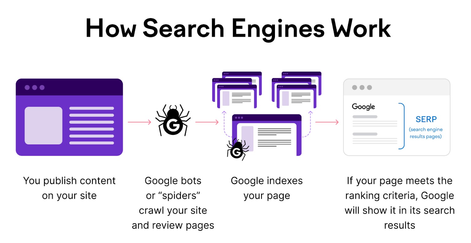
Improve crawlability for SEO
There is more to crawlability than just internal linking. Google sends its bots (crawlers) to continuously scan the web with the sole mission to evaluate and rank web content in SERPs (Search Engine Results Pages). Your job is to make their job easy.
Source: SEMrush
Crawlability means bots can find, fetch, and understand your pages without running into loops, blocked assets, or duplicate versions.
When bots move smoothly through your site, the right pages get discovered and indexed faster. That usually means searchers land on more relevant URLs, which lowers immediate exits and reduces the chance of one-and-done visits caused by mismatched results.
These are some of the simplest, yet highly effective crawlability wins:
- Use an XML sitemap with only indexable, canonical URLs.
- Use robots.txt to stop crawlers from wasting time on low-value URLs with tracking or filter parameters, but never block important content pages you actually want indexed.
- Always use the correct HTTP response codes — 200 for live pages, 301 for permanent redirects, 404/410 for truly missing pages—so search engines don’t waste time indexing error pages disguised as valid ones (soft 404s).
- Make sure your most valuable pages are linked from main menus, hub pages, or within relevant content, so both visitors and search engines can easily find and prioritize them.
- Finally, keep all your URLs short, lowercase, and human-readable.
Improving crawlability may not seem exciting on its own, but its benefits steadily build over time — more pages discovered, indexed correctly, and ranked better. The easier your structure, the more consistently search sends the right visitors, resulting in fewer drop-offs and more engaged sessions.
6. Monitor and analyze user behavior
Last but not least comes the data analysis part. Make no mistake, it is important to do this regularly, before and after you take a corrective action that serves the purpose of reducing bounce rate.
User behavior should be the primary target for your analysis. Even the slightest fluctuations in user mood, preferences, their drop-off or exit points, will allow you to improve engagement and dwell time.
Use heatmaps and session recordings
Heatmaps answer “where did attention go?”; recordings answer “how did the journey feel?”. Together, they explain the drop-off rate with specifics instead of opinions.
The next time you see users stall on the same element, you’ll know exactly what to change.
Where do you begin? Start on the pages that get the most entrances, like the front page or landing pages. If visitors stall near the fold, you’re hiding value; if they rage-click the same icon, your affordance is unclear. These patterns drive the exit rate, even when the content itself is good.
It’s not rare in website design and UX when a single and simple element, like a forward button, becomes the bottleneck for the otherwise perfect website functionality.
A simple review routine for beginners:
- Open a click heatmap and confirm your main CTA is a hotspot.
- Check the scroll heatmap: if most stop early, move the key proof higher.
- Watch 10 sessions for the same page to spot common stumbles.
- Note any “dead clicks” on images or headings — make them links instead.
- Shorten a form, or improve its functionality if recordings show repeated field re-tries.
Use the evidence to reorder sections, make real buttons clickable, and surface the next step earlier. Small changes guided by real behavior reduce visitor drop percentage far more reliably than guesswork or the “best practices” copied from the web.
Track bounce rate in Google Analytics
When Google Analytics 4 (GA4) first launched, Google removed the classic bounce rate metric and replaced it with engagement rate. After feedback, they added bounce rate back in 2022, but defined it as the opposite of engagement rate.
Now, you’ll find it in Reports → Engagement; customize the Pages and screens or the Landing page report to add Bounce rate. In Explore, add it as a metric and break it down by campaign, device, or new vs. returning users.
Compare like with like. A glossary page that delivers a single definition will often show more one-and-done visits, while a tutorial should keep exit rate lower if it’s structured well. The goal is a low percentage of those users who leave for the pages that should encourage exploration — pricing, features, and category hubs.
If your bounce number looks odd, check the event setup. Marking “view” or cosmetic events as conversions will inflate engagement and make the drop-off rate look better than it is. We recommend keeping conversion events meaningful, so the metric stays honest.
Conclusion
Bounce rate is not something that can or should be eliminated entirely, but keeping it at a reasonably low level is a reasonable (feasible) goal of every conscious site owner. It’s like a blood sugar level — a high level is unhealthy and may indicate a disease, low levels are perfectly normal, but an absence of sugar in one’s bloodstream means the patient is essentially dead.
How to reduce bounce rate and make your website traffic look healthy? Several affordable and effective techniques can help:
- Use reliable hosting and a CDN for low latency, caching, and stability.
- Design websites responsively, ensure readable typography, and clear hierarchy to reduce layout shifts and friction.
- Simplify mobile navigation with obvious primary actions to offer users fewer choices and large tap targets.
- Create intent-matched, high-value content, and update old posts with fresh data.
- Add purposeful visuals and lightweight interactive elements that explain, guide, and prompt action.
- Strengthen internal links with contextual next steps; avoid dead ends at all costs.
- Improve crawlability: clean sitemaps, correct status codes, tidy parameters, and canonical URLs.
When everything is digitized and online, making informed, data-based decisions is the only sane option available. So, utilize whatever tool you know best, whether GA4, Heap, Hotjar, or Crazy Egg. They’ll help you track and analyze user behavior and, therefore, guide your site actions aimed at maintaining the abandonment rate at a healthy level.
All trademarks, logos, images, and materials are the property of their respective rights holders.
They are used solely for informational, analytical, and review purposes in accordance with applicable copyright law.